 |
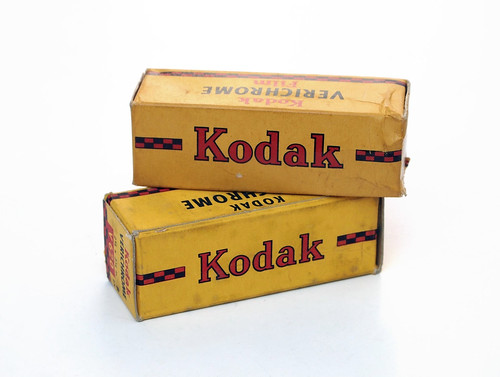
| Kodak Verichrome 620 films from the 1940s |
Within these three classes of black and white emulsions, there are further precise terms which are less well known, and less commonly used. I've recently been reading the Ilford Manual of Photography from 1946, and some films and plates are described as 'highly orthochromatic', to distinguish their sensitivity to yellow-orange light. Isochromatic is a term sometimes used for this type of emulsion, and Ilford did have plates named Iso-Zenith and Golden Iso-Zenith (while 'ordinary' is the term used in the Manual for blue-sensitive plates and films). The iso prefix means 'equal' and presumably relates to the emulsion's sensitivity to yellow light being equal to blue. I've used Ilford's G.30 Chromatic plates, explicitly described as being "highly yellow and orange-yellow sensitive", which may be why these fifty-year old glass plates worked very well for night photography under streetlights. Further, there are also the terms orthopanchromatic (reduced red sensitivity compared to yellow and green), isopanchromatic (increased green sensitivity), and superpanchromatic (increased red sensitivity for use with artificial light, such as tungsten bulbs). In The Negative, Ansel Adams describes panchromatic emulsions as being Type A, B and C: panchromatic Type B has "generally uniform sensitivity over the entire spectrum under daylight conditions"; Type A is most sensitve to blue light (perhaps orthopanchromatic?); Type C, "most sensitive to red", appears to equate to superpanchromatic. Adams states that Types A and C (at the start of the 1980s) are "relatively obsolete". These nuances of spectral sensitivity I hadn't appreciated when first shooting, developing and printing black and white photographs, merely understanding that there was film, as far as I knew sensitive to all light, and paper, that could be handled under a safelight. The college darkroom I first used had a relatively bright orange-brown safelight, and would have been only 'safe' for blue-sensitive emulsions. Ansel Adams writes "although panchromatic films are used for nearly all general photography today, we should avoid prejudice against other emulsions since they may have practical and aesthetic application" and continues to describe their use in landscape and portrait work. As well as the Ilford plates already mentioned, I have enjoyed using ortho film for landscape work, such as Adox Ortho 25 and Kodagraph Ortho Negative ON4, both for its particular look, and for the ability to handle it under a safelight.
 |
| Kodak Verichrome backing paper |
The 1932 advertisement lists six qualities that Verichrome uniquely combines:
1. DOUBLE COATED. It has two layers of sensitive silver emulsion - a Fast one over a Slow.Quality 1, the double coating, seems to relate entirely to its latitude, but is a quality not often referred to (however, there are some films such as Adox CHS, which specifically list being single-coated as an advantage to sharpness of image). The Verichrome boxes do not rate the film for exposure, but I've read elsewhere on the net that the speed of Verichrome was 50 ASA, which may equate to 100 ISO in post-1960 rating (Verichrome Pan was originally rated 80, but became 125 ISO rather than 160 after 1960). The speeds of films and plates advanced rapidly through the 1930s and 40s, so even before it was discontinued, Verichrome could no longer be considered 'high speed'. Quality 3, the claim to enormous latitude must be taken with a pinch of salt. Perhaps, being orthochromatic, development by inspection would help an extremely gifted darkroom technician achieve printable negatives at either end of this range. Quality 6 is worth noting simply becuase amateur photographs still tended to be contact printed at this date.
2. HIGH SPEED. Good pictures can be made earlier in the day - and the year.
3. ENORMOUS LATITUDE. Because of this Double Coating, "Verichrome" allows remarkable latitude. A spool of "Verichrome" has been has been given relative exposures ranging from 1 to 2,400 and all have yielded printable negatives.
4. COLOUR SENSITIVITY. "Verichrome" is particularly sensitive to greens and yellows - the colours which predominate in nature.
5. NON-HALATION. A special red backing on the non-sensitive side, prevents halation and ensures clear-cut detail in brightest highlights. (This red backing disappears on development).
6. TRANSLUCENCE. This makes "Verichrome" negatives particularly suitable for enlarging.
There is a lot of fog, some pinholing, and general degradation of age, all to be expected, but sixty-six years after the 'develop before' date, the Verichrome negatives would still be printable, although the images below are scanned. I did not rate the film when exposing, instead I gave each frame as much exposure as was practical: the first image below was shot, hand-held at 1/25th with the lens wide open at f3.5; the second image was shot at 1/10th, resting on the railing of a bridge. The final shot is largely out of focus, I think due to the curl of the film being so pronounced that it was forcing the pressure plate back enough to push the film beyond the plane of focus.
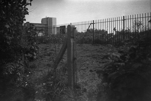 |
| Kodak Verichrome, develop before date October 1948 |
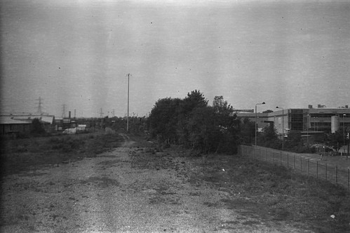 |
| Kodak Verichrome, develop before date October 1948 |
 |
| Kodak Verichrome, develop before date October 1948 |
Sources:
The Ilford Manual of Photography, edited by James Mitchell, 3rd edition, reprinted October 1946
The Negative, Ansel Adams, 1981
Orthochromatic, Isochromatic and Panchromatic entries on Camera-Wiki
Kodak Films on Early Photography