 |
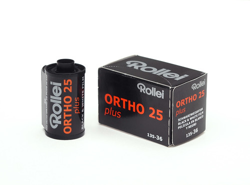
| Rollei Ortho 25 plus in 35mm |
"Although panchromatic films are used for nearly all general photography today, we should avoid prejudice against other emulsions since they may have practical and aesthetic applications. Both orthochromatic and blue-sensitive films are usually capable of higher contrast than panchromatic film. An orthochromatic film can be quite luminous in rendering foliage in the landscape since the foliage green is rendered relatively light, comparable to our visual response; caution must be exercised if the subject contains red-reflecting surfaces such as certain rocks, tree bark, and flowers, since these will be rendered quite dark. It can also be used in portraiture, where it will emphasise skin features such as lips and freckles, and darken (sometimes excessively) a ruddy complexion."Ansel Adams, The Negative
Orthochromatic film has seen something of an (admittedly niche) increase in popularity in recent years, most notably with Ilford releasing its Ortho Plus in both 35mm and medium format after many years of only being available in sheet film sizes. My experiences with other orthochromatic emulsions, such as Rollei ATO 2.1 Supergraphic and Kodagraph Ortho Negative film has often been one of attempting to tame their inherent high contrast to use the films for pictorial purposes, unlike the graphic arts applications that these were formulated for; other experiences with more general purpose orthochromatic camera films, such as the original Kodak Verichrome, Ilford Selochrome Fast Ortho and various glass plates, all involved using photographic material which was many decades old, where achieving any result in and of itself was far more important a consideration than the aesthetics of an orthochromatic rendering of a scene, thus negating, as Ansel Adams describes, the reasons one might favour orthochromatic over panchromatic film.
In my post on the Lomography Berlin Kino film, nearly six months ago now, I wrote of the #ShittyCameraChallenge prize I'd received (sponsored by David Walster - @196photo on Twitter), four different rolls of 35mm black and white film, none of which I'd used before. I also wrote about how I usually like to test films a little more fully before writing about them, but given the four all very different emulsions, I thought I might post 'single roll' reviews of these particular films. Towards the end of August, I shot the Rollei Ortho 25 plus with my Voigtländer Vito B. I chose this camera as I thought that its lens might be a sympathetic fit to the look of an orthographic emulsion, although this is probably too nuanced to really matter that much. Despite my best intentions, after developing the film languished until such time that I had to scan it and work over the digital images (generally, just spotting and adjusting levels). My previous use of other ortho films (as well as other slow films) gave me some idea of what to expect–or so I thought. I actually loaded the film under red safelight conditions in an attempt to get as many frames as possible from the roll, so as not to expose the start of the roll, pulling out enough film to secure the end to the take-up spool. The data sheet for Rollei Ortho 25 plus does state that "blue-green sensitivity allows the film to be handled under red darkroom lighting" but also under 'Laboratory Lighting': "The film can be processed in absolute darkness and should not be exposed to sunlight or darkroom lighting!" Presumably this refers to amber safelights rather than dark red. In the event, I got 39 frames on the 36-exposure roll, possibly not worth the extra effort.
After I developed the film and scanned the negatives, the results were more grainy than I had anticipated (for a 25 ISO film in comparison to other slow films I've used; clearly its nothing like a typical 400 ISO film). This may have been due to some overdevelopment and possibly some over-exposure (the grain is particularly prominent in the sky). Possibly some of this might be scanner noise, which I do find happens with dense negatives on my desktop scanner. I used Rodinal (as Ars Imago #9) to develop the film; possibly I should have used a higher dilution of 1+50 instead of 1+25 (the data sheet recommends Rollei Supergrain developer, not one I've ever used). Rodinal should work well with a slow film in theory: looking at other examples online, there does seem to be a range in terms of how fine the grain appears. Ideally, I'd like to print from the negatives in the darkroom, but my use of a darkroom for printing has somewhat been curtailed by the pandemic.
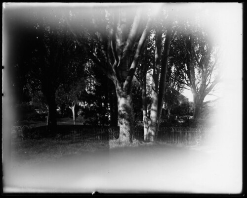
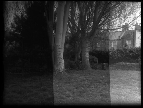
As most of the photographs were taken outside, often with a fair bit of sky in the frame, I did shoot a few frames with a yellow filter for comparison against those without (there was probably as much grey sky during the August of 2021 as there was blue). Generally, the sky has a 'soft' look to it, picking up more definition than I might have expected given the excess of blue light, but the use of a yellow filter does improve this: in the images below, the one with the filter really picks out the satellite dish against the darker sky on the distant building; at the same time it also makes some of the foliage lighter, with the tree in the middle of the frame appearing oddly washed out. I may have overcompensated in the exposure when using the yellow filter. I also feel the necessity of having a colour image here to really see exactly how the orthochromatic emulsion renders certain colours into tones.
 |
| Voigtländer Vito B with Rollei Ortho 25 plus - without filter |
 |
| Voigtländer Vito B with Rollei Ortho 25 plus - with yellow filter |
Without a filter, bright summer clouds in a blue sky do begin to blend together,giving the soft look I described as in the example below. I would have liked to have tried more of a range of filters than I did: the data sheet lists yellow, orange, and red filters: to be listed, I imagine that a red filter would still transmit enough of the spectrum that the film is sensitive enough to record.
 |
| Voigtländer Vito B with Rollei Ortho 25 plus - no filter |
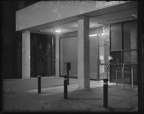
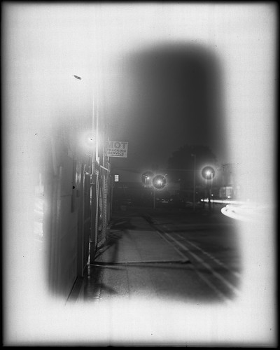
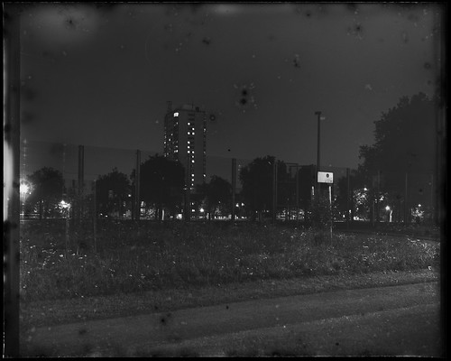
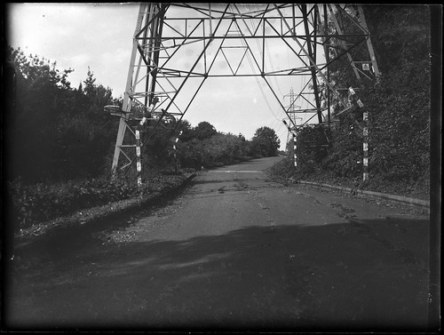
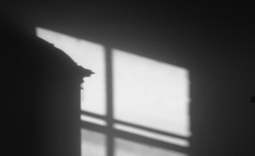
Some of the frames with particularly localised areas of strong highlights appear to show some halation, as in the images below. This may be due to the Vito B's lens, although this isn't something I've really noticed before and the Color-Skopar on the camera is coated. This isn't an unpleasant artefact, but worth being aware of when shooting–in so much as it may be an effect to seek out. A comparison with shooting the film in a different camera with a more modern lens might be useful here, but outside the scope of this post. Incidentally, all the photographs I took with the film were handheld, mostly outside on bright days where the 25 ISO speed was not and issue–the interior shot below was quite well lit from the window.
 |
| Voigtländer Vito B with Rollei Ortho 25 plus |
 |
| Voigtländer Vito B with Rollei Ortho 25 plus |
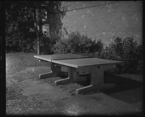
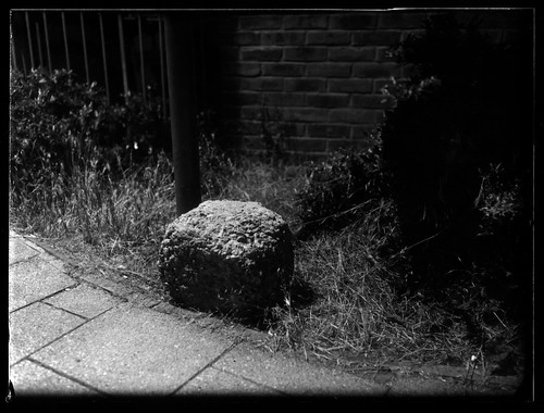
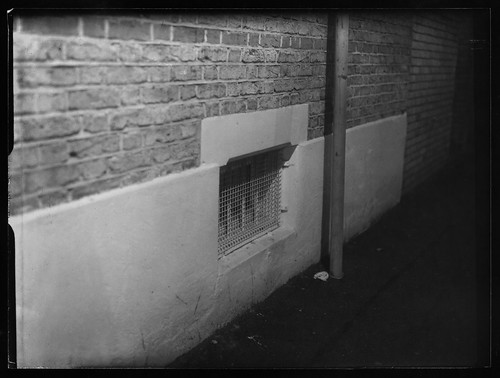
I didn't use the film for any portraits, so I can't specifically relate this use to part of what Ansel Adams writes about as regards portraiture. One subject that the film might be apt for could be architecture perhaps: rendering colour into equivalent tones may not be that necessary, and the slow speed of the film is less of a consideration than any potentially moving subjects. I did take a number of photographs which featured brickwork, and it would have been interesting to see how the ortho film rendered red bricks, but these are all yellow London stock bricks in the images below (in the third image, the wall of the house in the background is red brick though: the mortar stands out quite well against the bricks and just possibly this is enhanced by being rendered by orthographic film).
 |
| Voigtländer Vito B with Rollei Ortho 25 plus |
 |
| Voigtländer Vito B with Rollei Ortho 25 plus |
 |
| Voigtländer Vito B with Rollei Ortho 25 plus |
From using a single roll of Rollei Ortho 25 plus, I don't feel as though I've sufficiently tested the films capabilities: it would be useful to compare the results with the same subjects shot with panchromatic film, to try different developers, experiment more with filters, and print from the negatives, rather than simply scanning from them, as is the case with this post. It would be interesting to compare it to Ilford Ortho Plus too, a slightly faster orthographic film. Rollei Ortho 25 plus is also available in both medium format rollfilm and large format sheet film (according to the data sheet, in 4x5, 5x7, and 8x10 inch sizes) and I can imagine that it would be worth trying the film out in other sizes as well as the other approaches outlined above.


Sources/further reading
Rollei Ortho 25 plus data sheet (PDF)
Rollei Ortho 25 plus on Film Photography London
Rollei Ortho 25 plus on Blue Moon Camera Codex
Rollei Ortho 25 plus Alex Luyckx Blog
Ansel Adams, The Camera, Little, Brown and Company, New York 1980, twelfth paperback printing, 2005.