Thursday 31 December 2020

Revisiting the 'Wide Pic' Panoramic Camera

Wide Pic Panoramic Camera with Ilford FP4 Plus

After using the Coronet 66 last month for the #shittycamerachallenge, I decided to revisit a camera used previously for the challenge - the Wide Pic Panoramic Camera. I made little concession to the lighting conditions when shooting with it - I only had a couple of part-used rolls of Ilford FP4 Plus, and even shooting on days when it was sunny, on a couple of convalescent walks, the light was still not bright enough. I could have pushed the FP4, although the main issue was lack of shadow detail, so this may not have helped much. When using the camera before, I'd used 400 ISO film in the summer, which was fine for the single speed, single aperture plastic camera; ideally I would have used HP5 Plus perhaps, and developed it in such a way as to try to get as much shadow detail as I could, but, such is the contingent nature of the #shittycamerachallenge that the photographs will have to suffice for the last post of the year.


Monday 14 December 2020

127 Day December 2020

Rolleiflex 4x4 with Fomapan 400
Still recovering from Covid-19, last week's 127 Day coincided with one of the better days when I felt well enough to go for a short walk on a very grey day, but not early enough for the mist to make it interesting. I took the Rolleiflex 4x4, loaded with a roll of cut-down Fomapan 400. Inevitably, or so it felt, the one roll I shot was beset with issues. The start of the roll had some odd spots, visible in areas of the sky, possibly due to some developing problem (although I'm unclear what caused this); then a number of the shots had out-of-focus areas in the frame, which must be due to the film not laying flat inside the camera. This might be down to using cut-down film, possibly cut slightly too wide, and as a result, bowing out in the middle. Then the film got stuck after nine exposures; I couldn't work out why this happened, but after removing the film in a changing bag and developing it, some of the shots have light leaks at the sides, suggestive of a 'fat roll' (although I didn't really notice this at the time): however, if the film was cut just a little wide, this is no surprise. Somehow the unexpected inadequacy of the results feels fitting.


Saturday 5 December 2020

Three Colour 8mm Film

Three-colour process still

In writing a blog about film-based photography, there is always an unacknowledged (or perhaps underacknowledged) implicit understanding that any results are, by the nature of being shared digitally, a hybrid form. For some reason, I find this to be most acute in the moving image: the presence of the sheer physicality involved in projecting moving film becomes utterly absent once transferred into a digital form. The difference between a flat photographic print from a negative, and a screen-based display of that negative (whether scanned direct, or from a darkroom print) is great of course, but there is much recognisably the same about the experience of viewing (which, equally, is not to dismiss the real differences too). With physical moving images, the very apparatus of display plays a part in the viewer's experience; in the cinema, this is hidden from view, but in many other instances, the presence of the projector, screen, the sheer amount of material - reels of film, needed to kept, controlled as reels - impinges, bodily, on the viewer. This physicality has become somewhat fetishised in the visual arts: when shown in art galleries, films projected on 16mm or 35mm usually depend on the projector (and all the mechanisms for looping the film too) being present in the viewer's space.

A different kind of fetish is present when displaying such films in a digital form (something I am not immune from): the signs of the film's materiality, frame edges, perforations, dust and scratches - indeed, the very instability of the image, revealing that the apparent movement is comprised from numerous still images - are there as a guarantor of that materiality. I had been thinking of a way to use this digital hybridity in a playful way, that, in creating a digital version of a physical artefact, there was something more to use this for other than its convenience.  Last year, my interest in the three-colour process had been reawakened after assisting a student in creating images using the method, making colour images from three separate black and white negatives, shot through red, green, and blue process filters. I shot some still images with the Mycro IIIA a year ago using the technique (not posted to this blog), but also shot a short length of 8mm ciné film using the three colour filters.

Canon Cine Zoom 512 - Middlesex Filter Beds; Rollei 16 with Eastman Double-X film

For this, I finished the end of the roll of Orwo UP15 film that I had used for a number of other, very short films (Heatwave, Swinging Light), spooling off the shorter lengths as needed for each of these (I had also used a fair amount of the film for still photographs with subminiature cameras, notably the Mamiya 16 Automatic). This had a 'develop before' date of March 1976; using the film previously, I found an exposure index of 10 provided good results. I shot the film with the Canon Cine Zoom 512. Using a tripod, and a full wind of the motor, I framed the shot, depressed and locked the shutter release, and then held the red, green, and blue three-colour separation filters in front of the lens, for about 8 seconds each as the film ran through the camera continuously. I think that I may have shot the film at 8 frames per second in order to provide a slower shutter speed for the light needed to expose the film through the filters; the digitised footage itself plays at 12 fps. To compensate for the reduction in the transmission of the light through the filters, I metered the scene, then opened the aperture two stops. This meant that the sections of the footage in between the filters is over-exposed, and the section with the blue filter is underexposed, as the process blue filter transmits less light than the red and green filters.

For a subject, I shot the film at the Middlesex Filter Beds (a unintentional reference), with the thought that the three-colour process would record the autumnal colours. This was not entirely successful as I was probably shooting it too early in Autumn, in mid-October - and with the blue-filtered section underexposed, the colour record would not be very accurate (it might have been possible to open the aperture one stop further at this point, but not especially practical, doing the whole operation with one one pair of hands, passing filters one to the other after holding each one up in front of the lens). I then developed the film as negative in Ilfotec LC29 diluted 1+19 for 6m30s at 20ºC. This was over a year ago; only recently did I have the film scanned.

As 2x8mm film is 16mm-wide and run through the camera twice, I shot the sequence twice. However, I didn't use a changing back when removing the film spools and turning them over to shoot the second side (the 2x8mm film format is designed to be daylight loading, but this does mean sacrificing either end of the film on the spool in loading and reloading, not a problem when using a whole roll, and taken into account by the manufacturers of both film and camera; a different matter with a 'short end' such as I was using here). As I result, although I didn't realise it at the time of shooting, the first run of the film through the camera entirely lost the frames with the third filter in being exposed to the light. The second run of the film through the camera was more successful, but the section with the third filter was on the very end of the film, which includes the identification code of the film stock, punched through the film itself. This section of the film would usually have no images on, as it would be exposed on loading and reloading; I unloaded the film from the camera in the changing bag before developing.

In the resulting black and white film (above), on casual viewing the section with the red and green filters do not look especially different, except perhaps in the sky; the blue section is clearly darker, but also much lower in contrast. I composited frames from the scanned film in Photoshop, placing each black and white image into the red, green, and blue channels in the RGB colour mode.

RGB composite from the black and white negative scan
I had the 2x8mm film scanned as 16mm, i.e., the whole width of the film between the perforations, rather than having the film spit into two 8mm widths; as a negative, the film itself would not be projected anyway, so there is no need for it to be split as would be the case with film developed with the reversal process to make a positive transparency. As can be seen from the image above, the first run of the film through the camera, upside down on the right is a composite of incorrectly-filtered sections (the same colour filters do not align on each side of the film, and the blue-filter section on this run is also missing).

In creating a full-colour composite, I could have simply edited the film to a few seconds, aligning the three sections shot through the three different filters. Instead, I wanted to show the process as a set of logical steps, and, as the length of the whole film is just twenty-seven seconds when played back at 12fps, this could be repeated through each step. With the film was scanned as 16mm, as well as the width of image, the height is also over twice that of a standard 8mm frame, meaning that it shows two whole frames on both sides of the film. Repeating the film three times across the frame, I decided to keep the height of the original scan as this avoid making the proportions of the whole frame too long and narrow.

To show the process that achieved the colour image, I wanted to stage a set of logical progressions such as it might be possible to intuit how the colour image is created from a strip of black and white film without it necessarily needing an explanation (this particular post notwithstanding of course). The first repetition shows the film, in black and white, repeated in sync across the width of the screen (I could possibly have begun the series of repetitions as a black and white negative, but this seemed unnecessary); the second repetition, still in sync, shows the film in red, green, and blue. The next repeat then staggers the starting times of the red, green, and blue segments so that the point at which the correct colour filter appears in each coloured section is now aligned temporally. Repeated again staggered in time, the three colours spatially align on the the screen at that point to create the colour image. Remaining overlaid, each staggered coloured section runs to its end. The steps are then repeated in reverse, ending up back at the black and white footage, and in theory this could then be looped in on itself. 

A screen shot of the timeline in Premiere shows the way that the sequence of progressions is arranged. Although created in a digital form, it would be possible to recreate the result using three prints of the film, three projectors and the RGB colour filters in front of the right lenses; some of the earliest colour moving images used a not dissimilar concept, but on a single strip of film, with alternating frames shot through different colour filters, which would then be projected back through those filters to create an optical mix. The film (below) is essentially just an experiment intended to demonstrate - but also disclose - the technique itself.


Tuesday 1 December 2020

Coronet 6-6

Coronet 6-6 camera
The start of the new #shittycamerachallenge's 'holiday apocalypse' last month, running from November to January, almost neatly coincided with the new coronavirus lockdown restrictions coming into force in England on November 2nd. As with the previous period of 'lockdown' from March this year, the restrictions have not been as stringent as in many continental European countries: working in education, moving from the only then recently introduced tiered system to the lockdown had essentially no difference to my daily life, as I was still physically going to work, face-to-face, in the same way I had been since the start of September, while watching the rolling seven-day figures of cases, hospital admissions, and deaths, rise with what felt like inevitability, once schools and colleges opened at the start of term, and stayed open throughout. I was taking my photographs for the #shittycamerachallenge on my way to work, at lunchbreaks, and, on a couple of occasions, during exercise, alone, which was permitted. Despite taking all the precautions that were practical at work, again, with what felt like inevitability, I became ill halfway through the month, and a test confirmed that this was Covid-19. As a result, I finished my last roll of film while isolating at home.

The camera I had picked for the #shittycamerachallenge was the Coronet 6-6. I felt it fitted the spirit of the exercise due to being largely made from plastic, and with the most minimal user controls - and also that the camera had mould inside the body when I first opened it. The camera's name is sometimes written as the Coronet 66; above the lens, the two numerals are separated by the coronet logo, and, taking nominally 6x6cm images, no doubt the name would be said as "six-six" (it's also worth remarking that Coronet made a 127 format camera called the Coronet 4-4 from its negative size, and this is written on the camera as '4-4'). The Coronet 6-6 is a simple point-and-shoot Bakelite-bodied camera from the 1950s, using 120 medium format roll film, taking twelve 6x6cm images. This camera belongs to a class of mid-twentieth century cheap point-and-shoot models which can essentially be considered derivations of the box camera, and, as with the Coronet 6-6, not necessarily as well featured as many of those box cameras. These cameras also tend to reflect the availability of new materials: Kodak's Brownies began with cardboard bodies, before being replaced by metal; by the mid-twentieth century, many of these cameras were made from early plastics. The Coronet 6-6's body is made from Bakelite, one the most popular plastics of the era.

Coronet 6-6 camera
The Coronet 6-6 was manufactured by Coronet, a Birmingham-based company specialising in a broad range of cheap cameras, many of which share very similar features across different models. The Coronet 6-6 is clearly based on the body moulding of the Coronet Cadet and the Coronet Flashmaster, but with a different lens and shutter unit: the wider-angle lens of the Coronet 6-6 allows for a more compact camera. The Coronet 6-6 was also the basis for the Coronet Rapier, which uses an internal mask (and a different position of red window) to achieve sixteen 4x4 exposures on 120 film. (There is also a name variant of the Coronet 6-6 which has 'Flashmaster' on the name plate under the lens, but this is otherwise exactly the same model; there's also a variant of the Coronet Cadet which looks the same as the 6-6).

The Coronet 6-6 has fixed-focus meniscus lens, which looks and feels to be made from plastic. The focal length is reputedly 65mm, which gives a wide-angle image on the 6x6 format frame. Behind the lens and shutter is a metal plate with a smaller aperture punched into it, possibly around f11 or slightly smaller, such as a non-standard setting like f14. The shutter has a single speed, possibly around 1/30th to 1/50th, and is not provided with a bulb or time setting: it does have a flash sync for a proprietary flash, connecting to two metal ports on the side of the lens unit, as seen in the image above (an image of the flash here shows it to be almost as big as the camera). The viewfinder, placed directly above the lens, is of the reverse Galilean type. Frame advance is manual, by turning the large plastic knob to the side of the viewfinder, and using the red window on the back of the camera to follow the frame numbers on the film's backing paper.

Coronet 6-6 opened for loading
The back of the Coronet 6-6 is made from a piece of stamped metal with riveted spool holders and pressure springs. To load the camera, two catches either side of the camera, to which the carrying strap is attached, slide downwards, and the whole back slides off. Inside the camera, the Bakelite behind the lens is painted with a matte black, presumably to cut down on internal reflections from the smooth surface of the Bakelite. Loading film is simple: the take up spool is placed under the advance knob on the sprung spool holder, the new roll of film positioned in the other holder, and the backing paper stretched across to the take up spool. There is a serial number on the inside of the camera back, printed in very blotchy paint, a little hard to read.

I shot one roll of Ilford HP5 Plus with the Coronet 6-6, and two rolls of Fomapan 400. Although both are 400 ISO films, even on sunny days, due no doubt to the late time of year, these were not overexposed. I often read opinions online that, in box cameras (and the Coronet 6-6 can be considered a box camera here) one should use a slow film, as this is what these cameras were designed for. Indeed, the cameras were designed for films which might have been the equivalent of 25 ISO, but they were also intended to only be shot handheld, outside, in sunny weather in the summer months. Using a 400-speed film means being able to use the kind of simple camera that the Coronet 6-6 is in more conditions than those originally intended by the manufacturers, November in the northern hemisphere, with short days, sometimes sunny, sometimes very grey, embodying such conditions. The image below for example, looks like it was shot at dusk (helped, of course, in that interpretation by the lit streetlamp); it was actually taken around noon, but on a very overcast day; with a 100 ISO film it would have been quite underexposed. With a single shutter speed and aperture setting, when using the Coronet 6-6, to get acceptable results in a variety of the lighting conditions relies heavily on the latitude of whichever film is used; far better to use a faster film and potentially overexpose it for some shots, than a slower film and not take a shot because the sun isn't shining.

Coronet 6-6 with Fomapan 400
In use, I found the wideness of the lens occasionally surprised me: I'd see what I thought might make a fitting subject, raised the camera to my eye, then realised I had to get closer for a composition anything like what I had thought I'd get. I also hadn't anticipated how slow the shutter was - after developing the first roll from the Coronet, a number of exposures had camera shake. This is also partly due to the shutter button, a big plastic lever offset from the lens. There is a small amount of travel which evidently tensions the shutter, but then it gets quite stiff just before the shutter actually releases. It is also quite flimsy, and bends backwards, and on occasion got caught on a small protrusion on the moulding behind it, none of which made for a smooth release. I was more conscious of this as I shot more with the camera.

Coronet 6-6 with Ilford HP5 Plus
The lens displays all the classic aberrations one would expect from a plastic meniscus: the above image, from my first roll through the camera, does have some camera shake, but also clearly evident is pincushion distortion, seen in the verticals. Without camera shake, the lens is moderately sharp in the centre, but this falls off quickly towards the sides and corners. I haven't used colour film with the camera, but no doubt some chromatic aberration would be seen. Also discernible is astigmatism and coma, flare, and in a few shots what looks like internal reflections, despite the matte paint. Given the limitations of the lens, it's quite understandable that there would be a version of the camera which only used the central portion of the image in the guise of the Coronet Rapier. The fact that the Coronet 6-6 uses medium format film is somewhat negated by the qualities of the lens: unlike a Kodak Brownie (and there are simple box cameras with much better lenses), for example, here the larger negative format is lost on the poor definition of much of the image.

Coronet 6-6 with Fomapan 400
Being aware of the limitations of the Coronet 6-6 meant I sought out subjects and compositions where these limitations either didn't matter, were less obvious, or even added something to the image. With the photograph above, some vignetting, and falling off of definition helps with the sense of depth recession, enhancing the concentration on the lit leaves in the middle of the frame. I also tended to avoid any compositions with clearly rectilinear subjects, choosing more oblique angles where appropriate.

Coronet 6-6 with Fomapan 400
Sometimes none of these approaches really worked, and the photographs that resulted were just unsatisfactory, despite whatever impulses made me press the shutter at the time; frequently, the wide angle of the lens, the lack of definition towards the edges and other aspects just produced images which had a distracting 'busyness' to them. However, the pleasure in using a simple point-and-shoot camera like the Coronet 6-6 largely resides in the fact that the operation of the camera is entirely about the subject and composition with no other concerns in the taking of the photograph.

Coronet 6-6 with Ilford HP5 Plus
Coronet 6-6 with Fomapan 400
Sources/further reading:
Coronet 6-6 on Camera-Wiki

Monday 26 October 2020

Isolation Projects Revisited

'Quarantine' 9x12cm paper negative on Ilfospeed grade 2 RC paper

In my post Isolation Projects, written five months ago, I described in detail an ongoing series of photographs, simply titled 'Quarantine'. These were paper negatives, shot each day, of the tree outside my window. At the time, I wrote that the project had a definite start, and that some UK-wide restrictions were being eased then, at the start of June. Since then, more restrictions were eased in July, then there was the 'eat out to help out' scheme; in September and October schools and colleges reopened for in-person teaching (schools had been open all through the height of the restrictions for vulnerable children and those of key workers of course); since then the number of coronavirus infections have begun to increase rapidly and new restrictions are in force. Currently, London, where I live, is in 'tier 2' the second highest or strictest measures. I continued taking photographs for the 'Quarantine' series each day all through the summer, unsure when there would be a logical point with which to end the series.

'Quarantine' 9x12cm paper negative on Ilfospeed grade 2 RC paper

In the previous post, I described the considerations of using different papers, mostly in terms of graded against variable contrast papers, finding that a light green filter effectively gave Ilford Multigrade paper sufficiently lower contrast to record both highlight and shadow details in most lighting conditions, as grade 2 paper unfiltered generally achieves (the difference between bright sun and overcast days is still quite marked). I have persisted since then in the routine of taking two photographs each day, one on old Ilfospeed grade 2 paper, one on Multigrade IV (it seemed prudent to shoot two photographs, rather than just one each day, for insurance). Currently, I have every intention of continuing the series for the time being; although the 'isolation' of the title of my previous post became more theoretical than actual during the later part of the summer, it still feels appropriate to the act of taking photographs of a small slice of the world outside through a window each day, and 'Quarantine' is appropriate enough as a title (I did consider that the project should initially last the 40 days that the word quarantine is derived from, but at the end of that time, restrictions were still strict-relatively speaking, in comparison, other countries were far stricter-so I continued the photographs; since then I have personally had two periods of self-isolating as a precaution in the last two months). Reflecting on the experience of having passed six months of this particular project, I've written a post for the Undertow Research blog here

Tuesday 13 October 2020

A View of Delft

“For it is not a question of presenting works in correlation with their time, but rather, in the time in which they are born, of presenting the time that knows them.”
Walter Benjamin (italics mine)

When Vermeer was ‘rediscovered’ in the nineteenth century, his oeuvre scattered and attributed to others, there was no unified idea of what a Vermeer painting was, and therefore what could be looked at and considered a Vermeer. Now, Vermeer is generally thought of as a painter of quiet interiors, usually with a solitary figure, usually female, with just a few odd paintings lying outside these descriptors. However, in this period of rediscovery, many other artists’ works were attributed to Vermeer, driven by Théophile Thoré’s conception of what Vermeer’s oeuvre should look like. Thorè, writing under the pseudonym Willem Bürger, in his article ‘The Sphinx of Delft’ in the Gazette de Beaux Arts (1866), included twenty-two landscapes and street scenes, around a third of the paintings that he listed as being by Vermeer, seeing the artist as a painter of views (these paintings are now attributed to Vermeer’s contemporaries Jacob Vrel, his near-namesake Dirk Jan van der Meer, and the much later amateur painter Jan van der Laan). That Thorè-Bürger saw Vermeer as a painter of views was no doubt influenced by the impact of his encountering the View of Delft and the Little Street:

"In the museum at the Hague, a superb and most unusual landscape captures the attention of every visitor and powerfully impresses artists and connoisseurs. It is the view of a town, with a quay, old gatehouse, buildings in a great variety of styles of architecture, garden walls, trees and, in the foreground, a canal and a strip of land with several figures. The silver-gray sky and the tone of the water somewhat recalls Philip Koninck. The brilliance of the light, the intensity of the color, the solidity of the paint in certain parts, the effect that is both very real and nevertheless original, also have something of Rembrandt.

When I visited the Dutch museums for the first time, around 1842, this strange painting surprised me as much as The anatomy lesson and the other remarkable Rembrandts in the Hague museum. Not knowing to whom to attribute it, I consulted the catalogue: View of the Town of Delft, beside a canal, by Jan van der Meer of Delft. Amazing! Here is someone of whom we know nothing in France, and who deserves to be known!"

[…]

"Later, even before 1848, having returned to Holland several times, I also had the opportunity of visiting the principal private galleries, and in that of M. Six van Hillegom—the happy owner of the celebrated portrait of his ancestor, Burgomaster Jan Six, by Rembrandt—there I found two more extraordinary paintings: a Servant pouring milk and the Façade of a Dutch house,—by Jan van der Meer of Delft! The astounding painter! But, after Rembrandt and Frans Hals, is this van der Meer, then, one of the foremost masters of the entire Dutch School? How was it that one knew nothing of an artist who equals, if he does not surpass, Pieter de Hooch and Metsu?"

In my previous post, Cameras Obscura, I wrote about my own encounters with the work of Vermeer, and of seeing the Little Street while studying A-level art, and of Arthur J. Wheelock Jr.’s monograph on the artist; a section of this book details Delft’s brief artistic flourishing in the mid-seventeenth century - as well as containing photographs of the (then) contemporary Delft (the book was first published in 1981). As a result I had my own imaginary conception of the city long before I travelled there, and one built in a formative stage in my own life. Arriving in Delft by train, after dark, at the very end of last year, walking from the station to the apartment where we stayed, I suddenly found myself in the market square, confronted by the Nieuwe Kerk, familiar from Fabritius’s View, as well as its tower appearing in Vermeer’s View of Delft. Like finding Alice’s grandmother’s house from the film Alice in the Cities in Gelsenkirchen four years ago, written about on my other blog, this confirmation - in a physical reality - of a world as experienced through images, and, as such, this was an imaginative world, an idea, a conception of place invested with something equivalent to a mythical existence, accessed through its representations, although one much more particular than those larger, more widely-held mythologies of Paris or New York for example. My interest in Wim Wenders’ films of the 1970s was based, in part, through my prior experience of reading about the films as a student, without, at the time, being able to see them; reading about, and seeing Vermeer’s (and Fabritius’) paintings as a teenager, and, perhaps, with an intervening period of my life, many years in fact, in which I did not think about them very much, little did I suspect, then, that one day I would find myself in Delft, and, indeed, staying on Nieuwe Langendijk, a street which continues on from Oude Langendijk, which itself runs alongside the Nieuwe Kerk, and is the corner location of Fabritius’ A View of Delft; Vermeer himself was documented as living on on Oude Langendijk in 1660. 

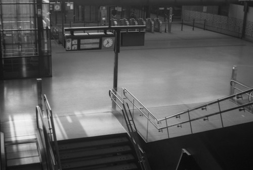
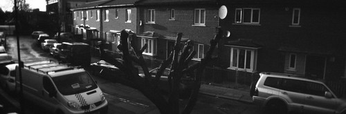
Delft central station, Kodak Retina IIa with Agfapan APX100

Much is made of the contemporary experience of the ‘non-place’, and the new railway station in Delft, the first impression of the city when arriving by train, conforms in some respects to this idea of the non-place, but then, moments later, standing in the market square, there was a feeling, a feeling of being definitely placed, by the Dutch vernacular architecture of course, and by the memory of those second-hand impressions of the city through the work of Fabritius, Vermeer, and de Hooch, and the material commentary of prints, drawings, and maps which often contextualises these artists and others. In writing about Alice’s Grandmother’s House I quoted, then, at length, a passage from Georges Perec’s 'Species of Spaces': “To cover the world, to cross it in every direction, will only ever be to know a few square metres of it, a few acres, tiny incursions into disembodied vestiges, small, incidental excitements, improbable quests congealed in a mawkish haze a few details of which will remain in our memory…” which summed up the particularity of how it felt to be there, then, at that moment; in the same passage, the phrase “out beyond the panoramas too long anticipated and discovered too late” could stand in for the title of this post.

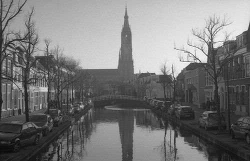
Nieuwe Kerk, Delft, Kodak Retina IIa with Ilford HP5 Plus

A day earlier, I had been in the Rijksmuseum. As well as the Maidservant Pouring Milk, I had seen again the Little Street, this time paired with Velazquez’s similar-sized landscape of the gardens of the Villa Medici as part of the temporary exhibition ‘Rembrandt-Velázquez: Dutch & Spanish Masters’. There’s something about these two small paintings by two artists not known for making views which makes them remarkable; one wonders exactly how they conceptualised what they were doing when they made these works. Of course, there are many paintings like Vermeer’s Little Street, alike enough that they were at one time attributed to him, and yet unalike, now, that they have become stripped from his oeuvre, given to Vrel and van der Laan, with something about these other paintings, suggesting a fidgety, sentimental or anecdotal quality (apparent, too, or too often, with Pieter de Hooch); however these are all part of a general trend in Dutch art of the seventeenth century that fundamentally re-thought what it was to make pictures, but in the particularity of Vermeer’s Little Street, and in the View of Delft, there is something more, a foreshadowing of a tendency which would begin to make itself known over a century later in artists’ sketches from nature. Peter Galassi, in Before photography: painting and the invention of photography traces the “ultimate origins of photography” to the invention of perspective, an ordered way of seeing the world with everything in its proper place and relation to the viewer; establishing this, Galassi elaborates that it is not the development of perspective construction itself (though necessary) which leads on to the invention of photography, but how, in the hands of artists, it is used:
“The Renaissance system of perspective harnessed vision as a rational basis of picture-making. Initially, however, perspective was conceived only as a tool for the construction of three dimensions out of two. Not until much later was this conception replaced—as the common, intuitive standard—by its opposite: the derivation of a frankly flat picture from a given three-dimensional world. Photography, which is capable of serving only the latter artistic sense, was born of this fundamental transformation in pictorial strategy.”
As an example of this, Galassi contrasts a Renaissance painting known as the Urbino Ideal Townscape or Ideal City (c. 1470), in which the space depicted is placed before the viewer; with Emanuel de Witte’s Protestant Gothic Church (1669), the viewer is placed in the space. Galassi describes the two different approaches as depending of two different mentalities: the former, using perspective, in constructing a world; the latter, again using perspective, but taking from the world as an already existing arena of potential paintings. (Galassi also describes a new particularity of time in de Witte’s painting: the Ideal City is suffused with an even light which gives equal clarity to the architecture; de Witte’s painting in contrast shows sunlight breaking up this clarity for a specific time of day - and something analogous is happening with Vermeer’s View of Delft). Galassi states that, for the historian of perspective, its development and uses do not follow a smooth progression, but, instead, this history is
“…denser in the fifteenth, seventeenth, and nineteenth centuries, when innovative conceptions of perspective were richer than during the sixteenth and eighteenth centuries. And its emphasis is not guided by absolute value, for Saenredam will claim attention equal to Vermeer, and the young Corot more than David. Similarly, for a given period, it will favor some branches of art over others. The problem of vision was often most directly posed, for example, in the painting of landscapes and views. This tradition thus receives disproportionate attention; around 1800 it is the entire domain of the most radical experiments in the role of vision in art.”
This “problem of vision” explored in Vermeer’s work may explain his relative obscurity in the century following his death - and his ‘rediscovery’ in the age of the invention of photography. Like Saenredam’s radical compositions (“Not until the late nineteenth century was such a willfully fragmentary and internally discontinuous view the common option of every painter.”), Vermeer’s views are also, in their own way, anachronistic in conception, rare “forward glances” in Galassi’s phrase, the logic of which would have to wait for the invention of photography to be properly understood: “perhaps one of the ironies of art history that with a Kodak any child might now produce by accident a composition that a great artist like Vermeer had to use all his ingenuity […] to achieve.” (R. H. Wilenski, An Introduction to Dutch Art, 1928 quoted in Chrales Seymour Jr., ‘Dark Chamber and Light-Filled Room: Vermeer and the Camera Obscura.’)

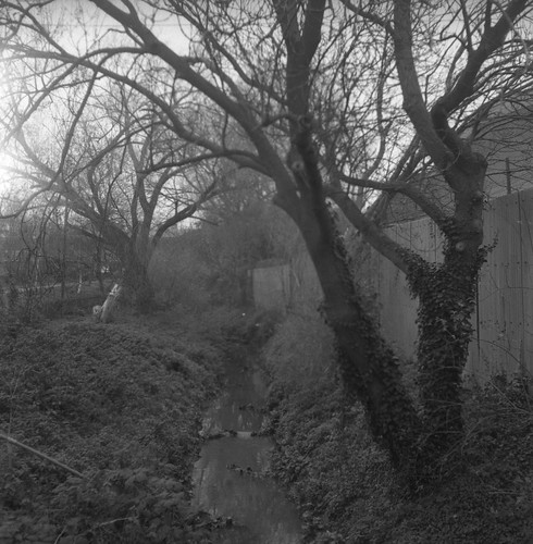
View across the Kolk, Delft, Zodel Baldalux with Ilford FP4

Vermeer’s View of Delft was painted from a viewpoint looking roughly north, across a harbour called the Kolk, outside the city’s walls, towards the prominent Schiedam and Rotterdam Gates, with the tower of the Nieuwe Kerk prominently lit, and the Oude Kerk tower largely obscured. After visiting the Vermeercentrum and the Nieuwe Kerk earlier in the day, finding the location from which Vermeer painted the View of Delft was straightforward: although almost all the buildings depicted by Vermeer have gone, the general topography is the same: the Kolk, the canals branching off into the city from behind where the city gates were, the general street plan, and the Nieuwe Kerk tower of course (visually, the twin spires of the 19th-century Maria van Jessekerk echo the absent spires of the Rotterdam Gate on the skyline to the right of the Nieuwe Kerk). Wanting to make something about the experience of being in this place, but not knowing how to react, I filmed the reflections of the skyline in the water - the reflections being one of the most remarkable aspects to the painting - with the outline of the Nieuwe Kerk tower clearly seen against the late afternoon sky, its silhouette dominating, in a manner essentially absent in the painting (as it is brightly lit, with the sky behind it, the reflections below only pick up the dark masses of the tree or trees and the Rotterdam Gate in shadow either side of the more distant tower). Perhaps this was appropriate - filming a reflection of the tower which is impossible to discern in the painting - as the current tower of the Nieuwe Kerk is not the same as that depicted in the View of Delft. The Nieuwe Kerk was struck by lightning in 1872 (having been struck and partially destroyed before in 1536; the rebuilt tower that appears in Vermeer’s painting survived the ‘Delt thunderclap’ of 1654) and the tower rebuilt a second time as a result; the rebuilding of the upper stage of the tower used Bentheim sandstone, blackened through a reaction to atmospheric pollution, in contrast to the colour of the stage below, which gives the erroneous impression of having been scarred by fire. As well as not being the same tower reflected in the film, it is of course not the same water making its reflection.

Bolex B8, Retina IIa with Adox Scala 160

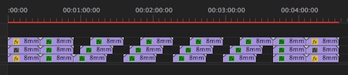
Although I didn't know it at the time, the Double-X film I shot here with the Bolex B8 wasn’t exposed properly due, as I later surmised, to the variable shutter being stuck in a near-closed position: I didn’t see the results until developing this roll of film some time later; however, as this footage was on the first roll of 8mm film from the trip that I developed, it did mean that I (rather belatedly) made a number of tests before developing the other two rolls of film shot in Delft, which, particularly in the case of the 'Pouring Milk' film, meant I was able to adjust the developing times sufficiently to get as good a result as was possible from the latent images. I have excerpted a short sequence as an animated GIF below; the thinness of the negative shows any dust incredibly well, a result of a lack of cleaning before scanning and ad hoc processing conditions - essentially attempting to improvise a means of drying 25ft of 2x8mm film in a hurry.


One reason for shooting film, rather than digital, were the sense of having a physical artefact, an indexical link to the contingencies of the location itself, ideas which probably do not hold too much weight in the digital present, especially with the results digitised and disseminated through a digital medium; regardless, what is recorded onto the physical medium is something other than a provisional interpolation of data (and, if ever exhibited, a positive could be printed from the negative and projected). In Ways of Hearing, Damon Krukowski attempts to encapsulate how it felt as a musician to be recording to tape in the 1980s, not an entirely unsympathetic analogy:

“In that analog studio, there was a feeling when the tape started rolling that this was the moment we would capture-a feeling of time moving both more slowly, and more quickly than usual. Like when you’re in an accident. Each split second is suddenly so palpable, as if you’re living in slow motion. Yet what do we say when it’s over? It all happened in an instant.

Analog recording is like an accident in other ways. On tape, there was no “undo”. You could try again, if you had the time and money. But you couldn’t move backwards. What’s done is done, for better and worse.”

Two days after visiting its location, we took the tram from Delft to the Hague to visit the Mauritshuis and see Vermeer’s View of Delft. Any attempt to describe the experience of finally seeing a painting familiar from reproductions for many years would be entirely inadequate. In real life, the View of Delft is both familiar and surprising (or at least to me, in some aspects, especially the thickness of the paint in some areas, notably in the near foreground) and one can appreciate the impression it made on Thorè-Bürger around the time photography was being invented. As a result, while still in Delft, I decided to revisit the viewpoint again. Having initially been to the spot with a camera but no clear idea, I needed to give myself a logical structure this time; in the interim, I had shot Pouring Milk and had used a duration for that film from a measure of how long visitors in an art gallery look at a work of art: while trying to find a definitive average, a different answer which I had also turned up was 17 seconds. Determining that, if I used a whole side of my last roll of 2x8mm film that I’d taken with me to Delft, shooting at 12 frames per second rather than 16fps, its duration should be long enough to contain 17 separate shots of 17 seconds each. Any response to Vermeer’s painting would only ever be inadequate; any attempt to communicate the personal experience of how it felt to be standing there, in that same location, looking over Delft from that same viewpoint, with the painting fresh in my memory, would also be inadequate. Acknowledging the futility of trying to engage meaningfully with such a canonical work of art, my approach was to not film the view itself: the film is built up from details around the viewpoint as it currently exists in the historical moment that I was there, then.

Thomas Elshuis, Panorama, Zodel Baldalux with Ilford FP4 

Facing the view, a raised platform above the quayside of the Kolk provides an approximate elevation to the correct viewpoint: Vermeer may have used the second floor of an inn which stood on that spot in the seventeenth century to make his painting. This platform is made from brick and paved, but when I was there some work to it was in progress or had just been finished: there were pallets of building materials collected there, paving bricks and kerbstones just at the right point of the platform overlooking the view. Behind the platform there was a patch of muddy, sandy ground which had evidently been re-landscaped recently, with a circular area of cobbles having been removed. In the middle of winter this was bare of grass, imprinted with footprints and tyre-tracks. Curving around the back of the raised platform, a steel structure supports a set of printed, translucent panels. This is a work of art called Panorama by Thomas Elshuis (although in the Dutch text, it seems to be called Gezicht op Delft - View of Delft), which brings together Newton’s discovery of the refraction of white light into the visible spectrum of colours with van Leeuwenhoek’s microscope, represented by drops of water, magnifying the sand from the bed of the Schie, the canalised river which meets the Kolk from Rotterdam and Delfshaven, and, perhaps, is also a reference to the sand incorporated into the paint in some passages of Vermeer’s painting. Photographs of this ‘folly’ (as Elshuis calls it) on the art in Delft website show sunlight streaming through it, highlighting the stained glass-like qualities of the translucent panels, making sense of the references to Newton and van Leeuweenhoek, an effect quite absent on a grey January morning. After I shot the film, behind the raised platform, partially covered with dirt, I discovered the two metal plaques set in the ground behind the structure which detail this piece of site specific artwork in Dutch and English. 

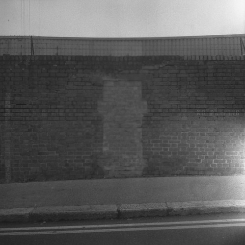
Metal plaques, Kodak Retina IIa with Agfapan APX100

Having shot the two rolls of (new) Double-X I’d taken with me, I had one roll of 2x8mm film left. This was Orwo UP21 with a process before date of November 1982. I had bought two rolls of this online with the same date, in the same lot, and had previously tested a short length cut from the other roll before travelling, and found the best exposure index for the film stock was around 12; I was also developing this as a negative: although nominally a reversal or transparency film, unlike some black and white reversal ciné film I’ve used, the Orwo film does not have a colloidal silver anti-halation layer, which means it can be developed as either a negative or a positive.

2x8mm Orwo UP21 film

I shot at 12fps for the increased duration this would provide, and this would incidentally mean a slower shutter speed, but the grey overcast morning light when I returned to the site was so low, I felt as though I needed an extra stop in filming, and rated the film at 24 rather than 12 (the light levels also meant that most shots were taken with the lens wide open, or close to wide open, and the accuracy of focus has suffered as a result). At the time I thought I might be able to extend the developing time a small amount to compensate. There was a general logic to the sequence of shots, although essentially improvised, moving from the very small, close-framed shots of the platform facing the view, to the final shots which show the artwork by Elshuis, but in fragmentary details. The editing of the film was done in camera, and the length of the film is shown in its entirety, with both leader and trailer. I loaded the film and unloaded to turn it over in a changing bag, meaning that the film wasn’t exposed to light in either operation, in order to use the whole length of the film. When developed, it was clear that the film had been exposed while wound on its spool, but I kept this bleached-out section, containing the identification code, the circular holes punched through the film at the start: light through these holes has imprinted itself through a couple of layers of the film; a wavy line, the shadow of the rubber band securing the roll can also be seen to the right hand side of the image.

When I came to develop the first roll of 2x8mm Double-X shot on this trip, as soon as I took the film out of the tank, I realised that something was wrong: it looked underdeveloped, or so I thought. I subsequently shot a number of short tests of both film stocks I had used in Delft, Double-X (and in doing so, discovered that single-perforated 16mm - having used all my 2x8mm perforated Double-X - would run through the Bolex B8, at least well enough to test the exposure), and the Orwo UP21 from the part-used roll I’d already tested in a still camera and not taken to Delft. I shot three test lengths of the UP21, decreasing the developer dilution and increasing development time as I went, in my attempts to get a usable result. Making these tests I realised - only gradually - that the camera was underexposing by around three stops, and my only explanation for this was that the variable shutter was stuck near closed, so in the shooting of this film, I had effectively exposed it around four stops faster than the exposure index I had tested for. As well as increasing time and decreasing the developer dilution, I also took two rather more extreme technical approaches: first, I flashed the entire roll of film in an attempt to raise the shadow values (as I would be pushing the film, the contrast would be increased, and I was expecting no or little shadow detail at this stage, although I had been filming in very flat, diffused light). To do this, I ran the whole roll of film through the Bolex again, double-exposing it by filming a featureless white wall - with the lens out of focus - and three stops below a meter reading taken from that wall. As before, I loaded, unloaded to flip the film spools, and finally unloaded the film using a changing bag after exposing both sides. I developed the film with Ilfotec LC29, diluted 1+9, for 20 minutes at 20ºC. The second approach was to tone the whole film with selenium toner after development, with the idea that this would act as an intensifier on the negative, providing a little more density. The end results are still far from what I had hoped. It’s possible that the toner may have simply increased the overall graininess of the negative, the fog of age; incidentally, the edge markings on the film look considerably blown out from the push processing. Due to the poor light levels, camera faults, and processing issues, the resulting images on the film are underexposed, hard to read, obscure. Titling it 'A View of Delft' is an assertion of what it shows, factually accurate, despite there being little of the location that is clearly recognisable in the film (although possibly I should call it 'Seventeen Views of Delft'). I have recently become interested in how the title of an artwork functions, how the title, as extrinsic content, is both integral to an artwork yet stands apart, separate from the object itself, a content which brings the viewer into a unique relationship to the art object, a relationship which, in some senses, ‘creates’ the artwork. In an essay called 'Entitling', John Fisher asserts that:
“Titles are names which have a sense; they call for responses. They determine, to a degree to which significant attention has never been given, interpretations and other acts.

[…]

Not all artworks are titled. Not all artworks need to be titled. But when an artwork is titled, for better or for worse, a process of interpretation has inexorably begun.”

Vermeer’s painting, the View of Delft has a declarative title which aids little in the process of interpretation, its need is small, especially if one is familiar with the city it represents; indeed, as with the title of Maidservant Pouring Milk, now more commonly known as the Milkmaid, as described in the previous post, the painting hasn’t always been simply the View of Delft: Thorè-Bürger knew it as View of the Town of Delft, which seems unnecessarily wordy, but a descriptive title suffices nonetheless. The changing function of works of art, through changing conditions of production and consumption, demand that, in many cases, the title has more work to do than might previously have been the case. As a title, A View of Delft alerts the viewer to the gaps in what it represents, perhaps appropriate to the contingent nature of working with a physical medium, film, the conditions of its making, and its unmet ambition in an attempt to meaningfully encounter Vermeer’s View of Delft.

Bibliography
Walter Benjamin, ‘The History of Literature and the Science of Literature’ from Poesie et revolution, Paris 1971, p14, quoted in Hubert Damisch, The Origin of Perspective, translated by John Goodman, Massachusetts Institute of Technology, 1994; originally published as L’Origine de la perspective, Flammarion, Paris 1987
Daniel A. Fink, ‘Vermeer’s Use of the Camera Obscura - A Comparative Study’, The Art Bulletin, Vol. 53, No. 4 (Dec., 1971) pp. 493-505
John Fisher, ‘Entitling’, Critical Inquiry, Vol. 11, No. 2 (Dec., 1984), pp. 286-298
Peter Galassi, Before Photography: painting and the invention of photography, Museum of Modern Art, New York, 1981 www.moma.org/calendar/exhibitions/2267
Jonathon Janson, 'Essential Vermeer' website: http://www.essentialvermeer.com/
Damon Krukowski, Ways of Hearing, MIT Press, Cambridge, Massachusetts, 2019
Georges Perec, ‘Species of Spaces’ in Species of Spaces and Other Pieces, translated by John Sturrock, Penguin 2008
Charles Seymour, Jr., 'Dark Chamber and Light-Filled Room: Vermeer and the Camera Obscura', The Art Bulletin, Vol. 46, No. 3 (September 1964), pp.323-331
Sandra Spijkerman, ‘Kunst in de Openbare Ruimte/Gezicht op Delft’, https://delft.kunstwacht.nl/kunstwerken/bekijk/330-gezicht-op-delft See also https://thomaselshuis.nl/
Arthur K. Wheelock Jr, Vermeer, Thames and Hudson, London 1988
Arthur K. Wheelock Jr., C. J. Kaldenbach, Vermeer’s View of Delft and his Vision of Reality, Artibus et Historiae, Vol. 3, No. 6 (1982), pp. 9-35

Tuesday 29 September 2020

Cameras Obscura

“It is not possible to describe for you the beauty of it in words: all painting is dead in comparison, for here is life itself, or something more noble, if only it did not lack words. Figure, contour, and movement come together naturally therein, in a way that is altogether pleasing.”
Constantijn Huygens, in a letter to his parents, 13th April 1622, quoted in Wolfgang Lefèvre ‘The Optical Camera Obscura: A Short Exposition’
Travelling to Delft at the turn of the year, many months now from the time of writing, I took the components to construct a camera obscura while staying in the city. The camera obscura was of simple construction, made from greyboard and black mountcard, using a plastic magnifying glass as a lens, and, for the viewing screen, a square of glass I’d ground myself, cut from an old photographic plate the night before leaving London to take an early train to Amsterdam. To focus the lens, the camera was made as a box inside a box, the internal one sliding in and out to change the distance between lens and screen. As it was made from cardboard, I was not convinced how well this would travel once constructed, with the necessity of carrying it in a rucksack, and so I found myself putting together the camera obscura in Delft from its constitutive parts. Although this was done for entirely pragmatic reasons, I decided to film this activity on 8mm, compressed into a sequence of short successive shots, edited ‘in camera’.
Had I designed this camera obscura from scratch, the size and shape would have been a little different. The size of the ground glass screen would have taken into account the lens’ coverage, and the depth of the camera would have been sufficient that, when collapsed, the lens would be focussed at infinity. However, this camera obscura was a recreation of one I’d made as a teenager. That camera obscura came out of my interest in optical phenomena then, although no doubt not so clearly expressed, and the use of the device by artists before the invention of a fixable, chemical photography.


I had made this first camera obscura with only a rudimentary understanding of what I was doing—I made no attempt, other than a crude approximation, to work out the focal length or the image circle that the magnifying glass projected, which would have provided the box with logical dimensions: I constructed a cube, with another cube nested inside, which could be withdrawn to focus the lens. As made, the camera collapses a little smaller than the infinity focus of the lens: no doubt, it should have collapsed either smaller still for convenience and portability (though this camera obscura is by no means large, being around 12cm square), or, when pushed together, the lens should be focused at infinity for a different kind of convenience. It was made from cardboard, joined with gumstrip, painted black inside to cut down on internal reflections (the reconstruction used black mountcard for its internal section). I used tracing paper for the original camera obscura’s screen, and ‘oiled’ it (using Windsor & Newton Liquin rather than actual oil) to improve its translucency; in the new camera obscura, I decided to use ground glass instead, hoping to get a better image, but I didn’t want to ‘improve’ the design in any significant way.


The lens was a magnifying glass from WHSmith, and I used this for the new camera obscura, above. The choice of this magnifying glass was determined by pure contingency: my father had exactly the same one, largely for examining prints (although he used an engineer’s loupe for any critical work); as children I and my brothers frequently borrowed this magnifying glass, and used it chiefly, in my memory at least, to burn holes in newspapers on sunny days. The paper would only burn where there was ink; at the time, I’m not sure whether I observed the images of clouds passing through the sky, projected onto the paper, nor if I really understood that the focussed point of light smouldering through text and half-tone photos was an image of the sun.


Compiling images for this post, I recently found a drawing I’d made from this camera obscura. Pasted into a sketchbook, the drawing’s position in it dates from 1990: without the evidence of the location of the page, or the juvenile handwriting under the drawing, in my memory, my attempts to use this camera obscura to draw from was somewhat later–not many more years, but I’d located, or, perhaps more accurately, relocated it to around the time I would have been studying for my A-levels two or three years later. [Edit 10/04/23: Re-reading old diaries, I found that the original cardboard camera obscura I had made in September 1993, just after my A-levels: I think the drawing above, in a sketchbook from 1990, was made using a set-up with a magnifying glass lens from my father, which he may have set up as a camera obscura.] Then I'd been looking at Vermeer as part of the ‘personal study’ component of my Art & Design A-level: this began with Caravaggio and the Caravaggisti, and the Dutch Tenebrists, as representing a certain idea of a realism in painting that appealed to me then. Vermeer’s earliest dated paintings featured as the end of a stylistic line through Carel Fabritius as a pupil of Rembrandt: Rembrandt was aware of Caravaggio’s work, although most likely only through prints. I made a copy of Vermeer’s Christ in the House of Martha and Mary at the time, using the reproduction from Arthur K. Wheelock Jr’s monograph on Vermeer, which catalogued all the paintings then accepted as genuine, and also includes a discussion on the possible use of optics by artists in the seventeenth century, with Vermeer’s links to figures such as Antonie van Leeuwenhoek. Coincidentally, during my A-levels the National Gallery in London put Vermeer’s Little Street on display against Pieter de Hoogh’s 1658 The Courtyard of a House in Delft in its ‘Brief Encounters’ series of small exhibitions. This also included Fabritius’ A View of Delft (sometimes titled A View in Delft), which is mentioned in Wheelock’s book in relation to optics, Wheelock stating that it suggests the artist experimented with wide angle lenses: this can be readily appreciated when confronted by the scene itself in Delft–standing on the corner between the street and canal where this viewpoint is located, the Nieuwe Kerk appears much, much closer, and dominates to such an extent that I found it impossible to compose a photograph that replicates Fabritius’ painting with a 50mm lens, considered a ‘normal’ angle on a 35mm frame–as in the photograph below. At the time of my A-levels, I was grasping for a 'realism' which retrospectively perhaps contained something ‘optical’ in all these very different painters. As it was, I didn’t use my camera obscura then to turn its projected images into a painting like those by Vermeer, or Fabritius’ view: it had little practical use, other than a very general ‘proof of concept’.


After my A-levels, at college and with access to a darkroom, I made a new back for the camera obscura into which I could slip a small piece of photographic paper in an attempt to fix the image seen on the tracing paper. Although I had been using the darkroom to develop my own film and printing negatives, I was working from a position of ignorance and assumptions, and my first attempts came out completely black, clearly as a result of overexposure. I had no real grasp of the interaction of the aperture of the lens, the intensity of light, and the sensitivity of photographic paper–all things one could readily look up online now, but such knowledge rather less easy to access then–and instead of trying shorter exposure times (nor constructing any form of aperture control), I thought the attempt a failure, when this was really a failure in not thinking through the implications of my first attempts and making some change in method.


A second attempt, around a year later while studying on my degree, worked rather better given the circumstances: I set the camera on a floor in a dark corridor, just outside the darkroom, the exposure times were longer as a result, and I used a thin piece of zinc that could be slipped behind the lens as a shutter. I then printed the paper negatives by contact onto another sheet of photographic paper in the darkroom as above. There was a lot of guesswork in these photographs as I had to focus the camera, measure or mark the distance that the back with the tracing paper was extended, then take the camera obscura into the darkroom, replace the back with the one loaded with photographic paper, place the camera back to where I had focused it, and extend the back with the photographic paper to the same distance, and then remove and replace the zinc shutter. I tried taking a couple of other photographs in the studios themselves, below, but being lit rather more brightly, these were overexposed (in remaking the camera obscura, I measured the focal length at infinity, which is around 13.5cm; with an aperture of 3.3cm, the resulting f-stop is very approximately f4, relatively fast even with photographic paper when the shutter is a piece of zinc to be raised and lowered behind the lens).


After these few photographs, I didn’t use the camera obscura again to make images, but it moved house with me several times through my student years and after, although the back for exposing photographic paper was damaged and discarded. I continued to be interested in the prehistory of photography however, and this vague interest in artists’ uses of the camera obscura was sharpened by the appearance in 2001 by David Hockney’s book Secret Knowledge: Rediscovering the Lost Techniques of the Old Masters, and the accompanying BBC film, in which he uses a projection inside a room-sized camera obscura to recreate (in drawing) the composition of Caravaggio’s The Cardsharps. Also featured in the programme was a contribution from Philip Steadman, whose book Vermeer’s Camera appeared the same year, the culmination of years of research, and this research had also been the subject of a television programme over ten years earlier.

Hockney and Steadman both demonstrated the practicalities of using a camera obscura to work from, a world away from my cardboard box and magnifying glass. The use of larger lenses with longer focal lengths allow the artist to be inside the camera itself, with paper or canvas in place of the ground glass screen (one of the revelations of Hockney’s book and programme was the (re)discovery of the mirror lens, used to explain how artists could have used projected images prior to the development of sufficiently sophisticated glass lenses in the latter sixteenth century to allow for the room-sized camera obscura); spurred on by these books, I had many conversations with a friend who was studying photography at the time, and we tentatively drew up an outline of a research project, going so far as to meet Philip Steadman at UCL, but our lives pulled in different directions, and the project fizzled out.


I did however use a camera obscura to make a single painting around 2002: this was achieved with a large magnifying glass placed on a stand and painted directly onto canvas from the projected image. This method wasn’t something I pursued any further, but it demonstrated the possibility of using a camera obscura as an aid to artists: this was painted rather quickly in one sitting (I spent more time making the stand for the magnifying glass), essentially establishing the composition, blocking in the tonal masses; it would be easy then to add detail and refine the painting, with further recourse to the projection of the camera obscura, or direct from the motif itself. It was clear to me that with practice and application one could learn to paint using even the simplest camera obscura set up. Despite my interest, and these tentative experiments, it was many years before I experienced a room-sized camera obscura, visiting Bristol around ten years ago, and going to the camera obscura in the Bristol Observatory on the Downs overlooking the suspension bridge. The construction of this camera obscura–with a rotating turret containing both lens and mirror to project the world outside correctly orientated onto a horizontal concave screen–was immediately redolent of the scene in Powell and Pressburger’s A Matter of Life and Death, where June visits Dr Reeves in his camera obscura. Here, it seems to stand as an analogy for cinema itself: secluded in the dark, inside the camera obscura, Dr Reeves watches the inhabitants of the village at a distance, unobserved. Perhaps this scene, where Dr Reeves first appears, is also intended as a subtle allusion to the idea that the power of doctors over matters of life and death is ‘god-like’, further reinforced by Reeves’ fate later in the film.


Returning to the Bristol Observatory last year, I was able to making a tracing of a small detail from the projection of the camera obscura in a notebook there, although also noting that the camera obscura’s angle of view seems to have changed from its historical horizon-following circuit, seen in the reproductions of nineteenth century prints, to now pointing below the horizon, no doubt in order to contain the suspension bridge fully in view, the chief landmark closest to this viewpoint on the downs. Of course, one does not need such an elaborate construction to experience the camera obscura effect: in the early weeks of lockdown in the spring there was something of a craze of creating camera obscuras in domestic spaces, with or without lenses, appropriate to the restrictions of the time, but also, in the UK at least, helped by the bright sunny weather. It’s something I’d done in a hotel room in Granada, Spain many years ago: the room had both curtains and blinds which could be co-ordinated together to make a suitably small aperture, while the bright morning light on the cathedral over the roof tops across the town square made the perfect subject, rotated 180º in the image below (I think I may have seen Abelardo Morrell’s series of hotel room camera obscuras not too long before).


In Amsterdam, prior to travelling to Delft, I had seen Vermeer’s painting A Maidservant Pouring Milk, these days more commonly known as The Milkmaid in the Rijksmuseum (the figure is clearly a domestic servant, not a milkmaid, but the latter title has stuck in recent years, very much in the way that the Girl with a Pearl Earring is now the title for Vermeer’s painting: when highlights of the Maurithuis collection toured in the early 1980s, the catalogue titles this iconic painting as simply Head of a Girl, elsewhere described as Head of a Young Girl; it’s hard to imagine this painting reverting to these titles now). Seeing A Maidservant Pouring Milk in the Rijksmuseum, I felt as though it had the opposite effect often experienced with reproductions of ‘realistic’ paintings: it looked more ‘photographic’ in real life, inverting the homogenising effect of reproduction, which removes the materiality of paint and flattening this to pure image. The effect seemed greater at a little distance, glanced across the room in company with the paintings surrounding it, even against the other two Vermeer paintings accompanying A Maidservant Pouring Milk.


A few days later, in Delft, I made another tracing from a camera obscura, this time in the Vermeercentrum. Despite having no paintings by the artist, the Vermeercentrum does provide a good introduction into Delft’s artistic milieu, and contains a display of high-quality reproductions of all the generally accepted Vermeer paintings at actual size, together. There is also a display on techniques and materials, and a camera obscura. This looks out through the wall of the building into the street, towards the market square and the statue of Grotius–and, on the right, towards the site of Mechelen, the inn that Vermeer’s father owned and where Vermeer grew up. The Vermeercentrum itself is housed in a recreation of the Guild of St Luke, of which Vermeer was elected head in 1662; the original building was demolished in 1879, replaced by a school. This camera obscura tracing, below, was a very quick sketch, and by necessity tracing through the page of the notebook, laid on the ground glass of the camera obscura. The paper was rather too thick to give anything other than the broad masses of light and dark, unlike the tracing from the Bristol camera obscura, where the image was projected onto the paper.


A Maidservant Pouring Milk is one of the paintings frequently cited as evidence of Vermeer’s use of the camera obscura, generally in relation to the rendering of the prominent still-life element in the foreground (“More ink has flowed to describe the poetic and optical qualities of this still life than perhaps for any other detail in Vermeer's oeuvre. The bread, basket, pitcher and bowl display such vibrancy and tactility that they effectively vie with the woman as the focus of the painting." Jonathan Janson, 'Essential Vermeer'). This is generally interpreted as displaying an imitation in paint of the circles of confusion seen in a camera obscura from point sources of light away from the plane of focus. Charles Seymour Jr. in ‘Dark Chamber and Light Filled Room: Vermeer and the Camera Obscura’ explicitly states that: “In order to paint this optical phenomenon Vermeer must have seen it, and it must be assumed that he could not have seen it with direct vision, for this is a phenomenon of refracted light.” To expand on Seymour’s statement, Daniel A. Fink, in discussing the fact that of “most” of Vermeer’s paintings demonstrate a principal plane of focus and that objects either side of this plane exhibit circles of confusion which “respect” that plane, that this is difficult to apprehend with the human eye, and impossible to ‘use’ creatively: “…one might be able to notice circles of confusion forming on the retina, but experimentation shows that the out-of-focus image formed on the retina is useless for picture-making purposes even if one is aware of its existence.”

Although much of the commentary on A Maidservant Pouring Milk does concentrate on the still-life element, with its pontillist rendering, it is the milk in Vermeer’s painting which strikes me as being quietly remarkable - in the same manner that the spinning wheel in Velazquez’s Las Hilanderas is: the paintings are almost exactly contemporary and both demonstrate a pre-photographic feat of observation, Velazquez’s painting of a spinning wheel blurred by motion more obviously so than the thin stream of milk in Vermeer’s picture. Other paintings of the seventeenth century show moving liquids in more generalised, approximate depictions (Ruisdael’s waterfalls come to mind here). Vermeer could have observed the stream of milk in a camera obscura, and, pouring slowly and steadily enough, this movement can approach the phenomenon of laminar flow, where it almost looks as though the milk isn't moving, as if it's a still image: it would be technically possible to trace this image rather than simply observing it (the latter of course being more likely), looking like a solid, non-moving pictorial element, its opacity as if of pure light. In the Rijksmuseum, the caption to the painting (in English) states that “except for the stream of milk, everything else is still”; of course, this is a painting, so all is ‘still’, yet, as an observed scene, the stream of milk could appear nearly as still. Indeed, as an action, in the pouring of milk, what moves more than the milk itself, is the angle of the vessel as its contents empty. Perhaps observing the near-stillness of a stream of pouring milk was the inciting incident in the creation of this painting.

These thoughts around Vermeer’s A Maidservant Pouring Milk led me to the filming of a performative gesture, a film of milk from a contemporary Dutch carton being poured into a blue-glazed ceramic bowl, with some bread from a Dutch supermarket to one side, an action enacted in the city of Delft–and then filmed (again) as a projection on the ground glass of the camera obscura I’d taken from London to Delft via Amsterdam in pieces and then built there. The duration of the film was determined by one measure of how long the average picture is looked at in an art gallery: 37 seconds (although different methods of designating that ‘looking’ generate different times in other studies); this necessitated a slow and steady pour, and, in doing so, this gave the stream of milk a more fixed aspect. The ground glass image was kept upside down, an abstracting effect useful for a disinterested observation, breaking the recognisable image down into patches of colour and tone.
I shot the film on Eastman Double-X black and white negative film. With an ISO of 250 in daylight, it’s a fast film for 8mm: historically, at the times these cameras were in common use, in the 1950s and 60s, less sensitive, finer-grained emulsions used for cine film would have been more typical. However, this granularity was in some senses appropriate to the subject through a series of visual analogies. I felt there was a visual equivalence between the grain of the ground glass (being home-made, this is not especially fine) and the grain of the 8mm film, thanks to the small frame size, (as well as having been pushed it three stops in the processing); materially, there is also the ground pigment in Vermeer's painting which makes up the image, and the still-life section of A Maidservant Pouring Milk famously has the specular highlights which suggested the use of the camera obscura; and in my own initial encounters with Vermeer’s work, through reproduction and the granular qualities of half-tone printing.

Filming the image on the ground glass screen was difficult due to the Bolex B8 having a non-reflex viewfinder: this caused two problems which required educated guesswork, the first being parallax–as the viewfinder is offset from the taking lens, the angle of view is different, and parallax error increases the nearer to the subject that the camera is placed. I simply lined up the lens to the centre of the ground glass screen as best I could, ignoring the viewfinder for this shot. The second problem was focus: in order to film the frame with the ground glass screen, I needed to focus closer than the minimum distance that the Bolex’s 13mm lens would allow, which is three-quarters of a foot or 9 inches, very close, but not close enough. For this I used a Proxar close-up filter; as I couldn’t see through the lens to check the focus, I had to estimate the difference of using this close-up from the power of the Proxar lens, which, with a power of 2, halves the focal distance, and I measured for this. The dimness of the ground glass screen meant that I needed to shoot with the lens wide open, thus not being able to stop down the aperture to gain a greater depth of field–which at such close focus was negligible–and also use a slower frame rate to achieve a slower shutter speed, shooting at just 8fps here. I actually shot this sequence twice: the first was not close enough; the second was, but is partly obscured by a developing error where the film on the spiral reel of the development tank came into contact with itself, thus preventing the developer acting on the surface for a few frames. This also shows the out-of-focus reflection on the ground glass of the camera itself filming–which I was unable to see due to the parallax issues already mentioned–perhaps it could be said that this reflection therefore divulges the means of its own making (as an insurance, I did also shoot the camera obscura image with an iPhone, but this was less satisfying: the digital compression of the close tones of the camera obscura image was somehow less satisfying than the grainy obscurity of the film image).

Returning from the Netherlands, I developed a different roll of Double-X shot with the same camera first. I’d bought some D96 developer in liquid form, a developer I’d not used before and these first results looked very underdeveloped, although, after testing some 16mm Double-X in the camera, I realised that this was actually underexposed. I made several tests with the same camera and 16mm Double-X before forming the hypothesis that the problem arose with the Bolex’s variable shutter. The lever to change the settings was stuck on the camera when I bought it, and, I had assumed, stuck in the open setting; after puzzling over a number of tests, I concluded that this was stuck near to being closed, and was underexposing the film by the equivalent of three stops. The roll of film containing the pouring milk sequences was developed with this in mind, with the result that the negatives were much higher in contrast than I would have liked, and this contrast emphasises the grain.


I made some prints in the darkroom from the negative, to check whether I’d successfully recovered the latent images on the film before sending the roll to be scanned professionally; when printing in the darkroom using Ilford Multigrade paper, with the lowest contrast filter I could achieve something like the tonal rendition I would have wanted for the film. The results from scanning were higher in contrast than the darkroom prints but acceptable (the film of constructing the camera obscura at the top of this post was shot on the same roll, but lit by a south-facing windows, while the pouring milk was filmed with a north-lit window, the less diffused south light here blocks up the highlights more, with little shadow detail in these sequences).


Returning from Delft, I made a new back for the reconstructed camera obscura to take some photographs with it on photographic paper, this time building in a darkslide to cover the sheet of paper for loading and unloading the camera. Attempting to make images of moderately close subjects, the definition from the lens was very poor, as above, not helped by the fact that it is difficult to ensure the distance from the lens to the paper matches that from lens to ground glass when swapping backs. To counter this, for the image below, I made an aperture plate from a piece of card with a hole punched through it which significantly improved the definition of the image. As a subject for these photographs, to test the new back for the camera obscura, I used my ticket from the Vermeercentrum–a cut-out of the figure of the Maidservant Pouring Milk.


Bibliography
Ian Christie, A Matter of Life and Death, British Film Institute, London 2000
Daniel A. Fink, 'Vermeer’s Use of the Camera Obscura - A Comparative Study', The Art Bulletin, Vol. 53, No. 4 (Dec., 1971) pp. 493-505
David Hockney, Secret Knowledge: Rediscovering the Lost Techniques of the Old Masters, Thames and Hudson 2001, and BBC television film
Tim Jonze ‘Honey, I flipped the garden: how I turned my house into a camera obscura’, The Guardian, Firday 24th April 2020. Retrieved from https://www.theguardian.com/culture/2020/apr/24/lockdown-culture-camera-obscura-photography 28/9/20
Martin Kemp, 'The Science of Art'
Wolfgang Lefèvre ‘The Optical Camera Obscura: A Short Exposition’, in Wolfgang Lefèvre (ed.) Inside the Camera Obscura – Optics and Art under the Spell of the Projected Image, Max Planck Institute for the History of Science 2007, p6
Jonathon Janson, 'Essential Vermeer' website: http://www.essentialvermeer.com/
Abelardo Morell, ‘Camera Obscura’ series, 1991-2019. https://www.abelardomorell.net/project/camera-obscura/
Charles Seymour, Jr., 'Dark Chamber and Light-Filled Room: Vermeer and the Camera Obscura', The Art Bulletin, Vol. 46, No. 3 (September 1964), pp.323-331
Philip Steadman, Vermeer’s Camera, Oxford University Press, 2001
Arthur K. Wheelock Jr, Vermeer, Thames and Hudson, London 1988