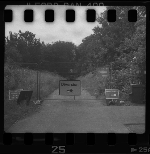
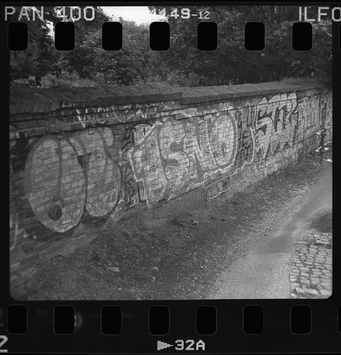
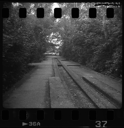
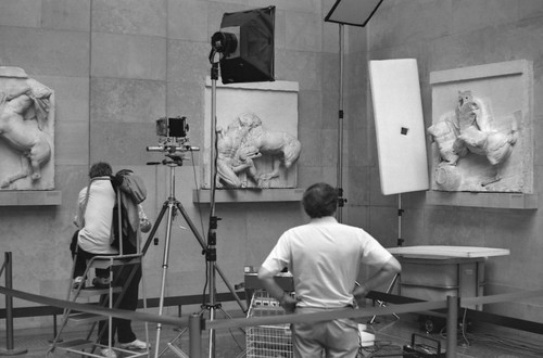
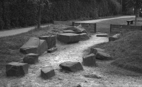
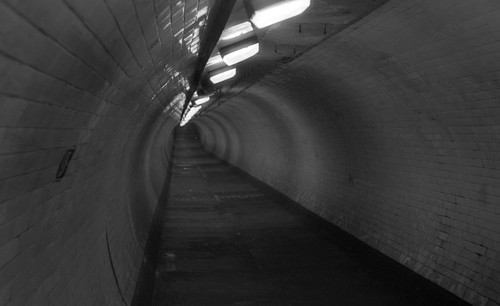
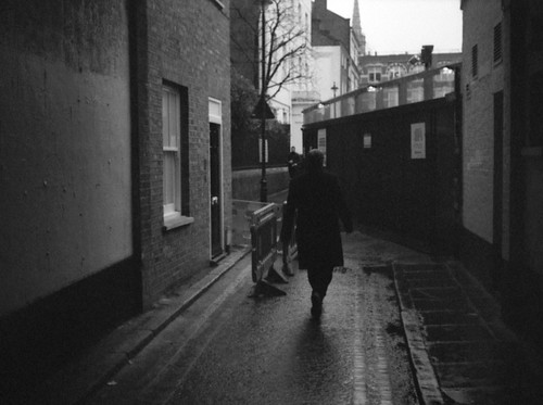
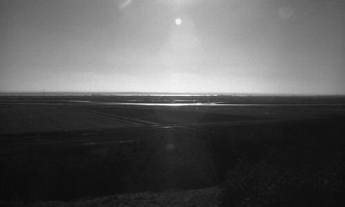
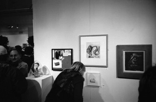
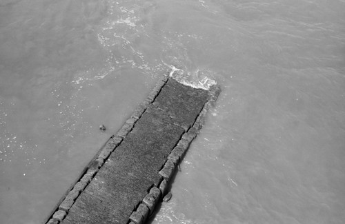
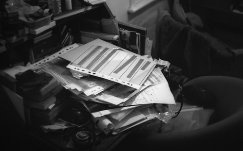
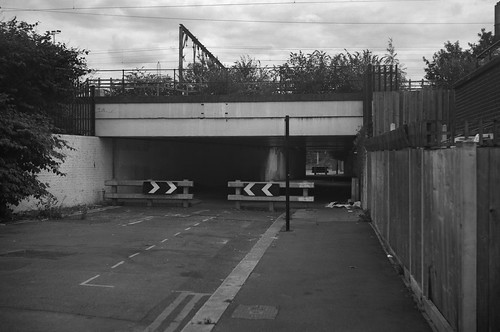
Showing posts with label Ilford XP2 Super. Show all posts

Saturday, 17 December 2022

'After Vermeer'


For many years, it was known that Vermeer's painting Girl Reading a Letter at an Open Window originally had a large painting on its far wall parallel to the picture plane which had been painted over. It was believed that  this had been done during the artist's lifetime, with the inevitable conclusion that this act was by the artist himself; more recent analysis had determined that a layer of dirt underneath the overpainted area must have taken decades to accumulate, and therefore the painting–or the version of it as had become familiar since the mid-nineteenth century ‘rediscovery’ of the artist–did not in fact reflect Vermeer’s intention for the work. The painting, held in the Staatliche Kunstsammlungen, Dresden was painstakingly restored, with the later overpaint removed, revealing a framed picture of Cupid holding up a playing card, which appears in two other works by Vermeer. The radically restored painting was the centrepiece of an exhibition, 'Johannes Vermeer: Vom Innenhalten (On Reflection)', at the Gemäldegalerie Alte Meister, housed in the Dresden Zwinger late last year. 

A couple of years ago I wrote about my interest in the art of Vermeer in two posts, Cameras Obscura and A View of Delft. These were written after a trip to Delft, Amsterdam, and the Hague, and the work which I had made there, referencing the long-speculated upon use of optical technology–the camera obscura–by Vermeer, and by another Delft painter, Carel Fabritius, the evidence of which appears to be present in their paintings to a greater or lesser degree. This ‘pre-history’ of the photographic has long been an interest of mine, in relation to my own paintings and their relationship to photographic source material, and I had, in the past, made work with specific references to the paintings of Vermeer. As part of the Staatliche Kunstsammlungen Dresden’s accompanying programme to 'Johannes Vermeer: Vom Innenhalten', there was a small display in the Zwinger’s Café Algarotti. This showed three photographic works in dialogue with Girl Reading a Letter at an Open Window: Alfred Stieglitz’s Sun Rays—Paula, Berlin (1899), which depicts the photographer’s sister writing a letter by an open window, strikingly illuminated through slatted blinds; Tom Hunter’s Woman reading a Possession Order (1997), more directly referencing Vermeer’s painting; and my own After Vermeer. In the Zwinger’s display, this was a digital print, a composite image constructed from a number of photographs which had originated on film. 

After Vermeer, digital composite

As an artwork in its own right, this particular version of After Vermeer had only ever existed as an image on a website many years ago–it was made as a reference image for a painting, one component among others, a working image for part of a trompe l’oeil painting: the painting as a whole had the conceit that it shows a section of an artist’s studio wall. The photograph was paired with a photocopy of the two-page page spread showing the reproduction of Girl Reading a Letter by an Open Window from Arthur J. Wheelock’s book on Vermeer. In the painting, my version of the Vermeer composition appears as a photograph that the artist is working from to make a painting: in the trompe l’oeil, this image has a grid drawn (painted) onto it for the purpose of transferring the image, usually with an element of scaling up, to this notional painting’s surface.

The Artist's Studio I, oil on board, 56x72cm

I had initially planned four trompe l’oeil paintings in the series of the studio wall. The painting with the photocopy of Vermeer’s Girl Reading a Letter at an Open Window was selected for the Royal Academy Summer Exhibition in 2001; a second painting, in the same format, with a photocopy of Edward Hopper’s Automat and my own composition based on it, wasn’t selected. I completed a third painting, with a composition of my own which was a more oblique referencing to one of Artemisia Gentilischi’s paintings of Susanna and the Elders, included within. The fourth painting in the series was started but never finished. All four paintings were designed to join together horizontally, with elements spanning from the edge of one painting to the next (that the compositions are cut off at the edges points to the paintings being ‘about’ or using the approach of trompe l’oeil, rather than being true trompe l’oeil works). I kept the board for the fourth painting for many years afterwards. It had a slight bit of painting of the overlapping newspaper clipping. Eventually this got damaged and the board was cut up to be re-used. 

At the time I made this series, in early 2001, I had no intention of making singular paintings of my own compositions within them which refer to the historical paintings that were their inspiration. This was partly that I (then) had a resistance to making paintings that appeared as if (based on) a single photograph, a resistance I relinquished a year or so later. From the other trompe l’oeil paintings completed in the series I used the digital images of my compositions for two back-lit transparencies mounted on lightboxes which were exhibited a couple of times; my version of Vermeer's Girl Reading a Letter at an Open Window was never made into a lightbox, partly a result of being dissatisfied with the quality of the images, mainly as a result of being made relatively cheaply. I began an etching of the image from the composition based on Edward Hopper’s Automat but this was never finished; the other composition I had made as a postcard before eventually using it, with a number of changes, as the basis for a larger painting.

After Vermeer, oil on canvas, 80x50cm

I returned to the Vermeer composition five years later to make a single painting. This was shown in an exhibition at a gallery specialising in photography and subsequently sold. When I received an email from the Dresden museum, my initial supposition was that they wanted to shown my painting in the accompanying programme; this has had a handful of enquiries in the years since I sold it and is now no longer accessible. However, they were interested in the photograph of After Vermeer, which had never been made into a physical version, only ever existing as a digital image on my website, on a page long since orphaned from the site itself, but still online (for a time, there were in fact two digital versions of the composition on my website, the first with a different position to the model’s head). I didn’t ask how the curator stumbled across this, but was relieved that I could show the photographic After Vermeer: as well as the rather low-resolution jpeg online, I still had the original working Photoshop file on a disk. 

A number of things came together to provoke me to make After Vermeer. The initial spark came from receiving a photograph of Tom Hunter’s picture from a teacher that I was still in touch with. This must have been after Woman reading a Possession Order was exhibited at the National Portrait Gallery, receiving a certain amount of exposure. I happened to be living in the London Borough of Hackney at the time, from the very end of the 1990s into the 2000s and, as a result, many of Tom Hunter's locations became very familiar to me, with just a faint, occasional sense of our paths crossing, with Hunter, no doubt completely unaware, several, many steps ahead. At the time I was still working out what kind of artist I wanted to be, but very quickly painting became predominant, although in 2000 this wasn’t entirely clear, and in recent years photographic processes in their own right have become more important once again. I hadn’t studied painting at degree level, studying printmaking instead; after art college I pursued painting as this seemed the easiest route at the time, something I could do in my rented room with the minimum amount of equipment (and cost), not needing a workshop, making do without a studio. 

Contact sheet, Zeiss Ikon Ikoflex Ic with Ilford HP5 Plus

The architecture of the kitchen of the rented house in which I was living at the time allowed me to create a very similar composition to Hunter’s photograph, with a large window to the left over the sink providing just the right kind of diffused light, similar to Vermeer’s original and Tom Hunter’s version. There was space, under the stairs by the back door, to stand far enough back to take the photographs. I think I had planned to combine a number of photographs together to make the digital image to work from for the painting: this allowed me to select from different shots, and combine these to make something closer to Vermeer’s painting. At the time, I imagined this to be like working with photography as a painter works, but, perhaps, this was more to do with not having the confidence to achieve what I wanted in a single photograph itself (I had been much taken by Jeff Wall’s working processes at the time, with pieces such as The Flooded Grave impressing me, although it’s very clear, practically, as to why that work could not be made as a single photograph). Unable to ignore the fact that this was a kitchen, I chose to depict the mundane action of drying dishes, with the light itself standing in or conferring any sense of a moment of the sublime, a contrast to Tom Hunter’s understated photograph given a sense of affect through its title. I did originally call my work After Tom Hunter After Vermeer.

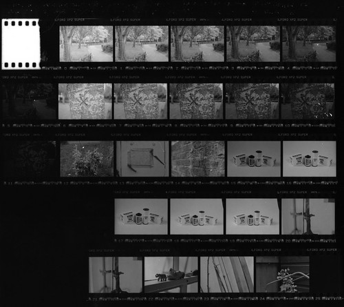
Contact sheet, 35mm Ilford XP2 Super

Returning to the original Photoshop file, I discovered that, on closer inspection, it wasn’t really finished: good enough to paint from, I hadn’t needed to ensure a level of finish as the digital file wasn’t to be the end result, but I was still surprised at the lack of care and attention to its editing. It had been made from scans of photographic prints rather than negatives: at the time, I had no access to negative scanning, nor a darkroom to make my own prints. The photographs were taken on medium format and 35mm negatives (from my Ikoflex twin-lens reflex and a Praktica BCA SLR: the strap for the Praktica can actually be seen in the final image, hanging down from being placed on the stovetop, just visible at the edge of the doorframe), but, working from small lab prints, the difference between the formats was probably negligible. This was still essentially a pre-digital world, photographically at least: the medium format film, Ilford HP5 Plus, was developed at a branch of Jessops that used to be in Moorgate; the 35mm XP2 Super went to Tesco on Bishopsgate, opposite Liverpool Street Station: the supermarket used a Kodak lab, and both were a convenient stop on my way to and from my part-time job on the other side of London Bridge. There was probably no consideration to use colour: black and white has a certain connotation of the ‘photographic’, historically situated of course, and a equivalence to the black and white photocopy from the book on Vermeer (with an incidental association to David Hockney’s approach in Secret Knowledge, reproducing paintings in black and white to emphasise their ‘optical’ look which the photocopy achieves). Opening the .psd file after twenty years, this had been saved with some separate layers (there were six layers, but with layers named Layer 8 and Layer 9, others had clearly been merged at the time), making it a little easier to edit the file to achieve what I hoped to be an acceptable a level of finish, neglected twenty years earlier. The original had been printed at 8x10 inches for the painting, smaller than A4 size; I was fortunate in that the curator found the image file to be sufficient in quality at double the size to include in the accompanying programme. Although I still had the original negatives I had been reluctant to remake the image from scratch–although I might have wanted to–and the re-edited digital file was printed for exhibition. I did scan the negatives later, and found that many of the frames were marred by motion blur or were poorly focused, possibly confirming my instinctive lack of confidence over getting it ‘right’ in a single shot.

The Vermeer exhibition opened around the start of the new academic year; I had hoped to go at the Christmas break (and was also hoping to be able to afford to do so too), which would have been around this time last year, to see the restored Vermeer, and to experience a work of mine on display in Dresden, reflecting on its afterlife as something made many years ago for quite different purposes. The emergence of the Omicron variant of the coronavirus meant that the exhibition shut to the public in November, shortly followed by UK nationals being prevented from travelling to Germany. Although 'Johannes Vermeer: Vom Innenhalten' closed at the start of this year, as scheduled, the accompanying programme display was extended into April 2022. Conditions sufficiently improved for travel into Europe in the spring, and I booked to do so in April, just before the extended display was due to finish.

The day before I left London for Dresden, I discovered that the accompanying exhibition in which my photograph had featured had already been taken down, short of the scheduled close its extended display, to clear the way for the accompanying programme for the next exhibition. This was 'Edward Hopper: Die inner und die äußere Welt (Inner and Outer Worlds)', opening a week after we were due to leave. In the Café Algarotti where the accompanying programme had been, I photographed my hand holding a mobile phone showing an image of this display–the image at the top of this post–no longer there by the time I had travelled to Dresden. The image within the image is too small to see my work, the framed picture on the right-hand side, disappearing behind the glare on the glass from the windows opposite, perhaps appropriate. Vermeer’s Girl Reading a Letter at an Open Window was absent, so I did not get to see the restored painting either; the Gemäldegalerie Alte Meister did have his Procuress on display, an earlier painting, where aspects of Vermeer’s particular stylistic approaches remain yet to be worked through, but the still life element of the painting equals that of many of Vermeer’s paintings in his mature style. The blue-and-white Westerwald stoneware jug is painted in sharp focus, existing in an isolated plane in depth, while the figures appear just out of focus, painted with some passages of incredibly thick paint, with barely any sharp outlines, the edges diffused, suggestive of a shallow depth of field from a camera obscura. The foreground carpet and fur provide a means to push the rest of the composition back away from the picture plane as well as hiding any compositional problems of how to resolve exactly how the figures are spaced around the table that the jug and glass are resting upon.

Recalling the kitchen of twenty years earlier, and making of that picture, the architecture in the apartment where we were staying in Dresden had an incidental affinity to Vermeer’s space: a window at right angles to the  kitchen worktop, admitted perfectly diffused light, picking out a kettle, some bread, with a heavy curtain casting a chair and a table into foreground shadow, coming together in a composition, photographed on colour film this time.


'Dresden', Zodel Baldalux with Fuji Pro 400H


Sources/Further reading
Wednesday, 19 June 2019

116 & 126 Days June 2019

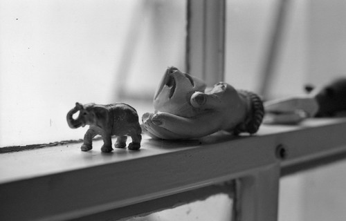
Kodak Instamatic 277X with Ilford Pan 400
Using the little-endian calendar in the UK provides two successive obsolete film format days in June: the 11th and 12th for 116 and 126 formats respectively. The regular 127 Days in summer and winter are relatively well established, in part due to 127 film still being available (if only just), whereas shooting film for both 116 and 126 formats does mean either sourcing long discontinued film or taking different strategies for using new film in the cameras.
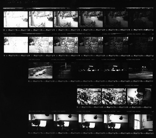
For Tuesday's 116 Day, I shot a single roll of medium format Ilford XP2 Super, rolled with 116 backing paper, with the Agfa Standard Model 255. I developed this with RO9 rather than C41, and had problems with overexposure (and perhaps overdevelopment), partly due to shooting into the light, late in the afternoon, despite the presence of cloud cover; scanning the negatives and attempting to retain any detail from the sky had the tendency to compress the mid-tones and shadows rather too much. The first image revisited one photograph from 2017's 116 Day, documenting the progression of demolition. Three of the six shots from the roll I felt worth salvaging.

Agfa Standard with Ilford XP2 Super
The following day I loaded a single 126 cartridge with Ilford Pan 400, and shot it with the same Kodak Instamatic 277X I'd used last year - and the main reason for using it was for its adjustable aperture: with a 400 speed film, this meant using a relatively small aperture for most shots (the camera's shutter speed is fixed at 1/80th), ensuring that the photographs were relatively sharp. After using the camera last year and having had many frames overlapping, I made sure that the film was fully wound on to the next frame, judging from the numbers on the backing paper, even if this meant taking fewer shots on the roll of film.

Kodak Instamatic 277X with Ilford Pan 400
Kodak Instamatic 277X with Ilford Pan 400
Kodak Instamatic 277X

Sunday, 21 October 2018

Ilford XP2 Super - Part Two

First roll of Ilford XP2, shot with Praktica BCA, July 1994
In my previous post, part one of Ilford XP2 Super, I revisited a film that I had used more than any other for a few years when I didn't have access to a darkroom, and had my interest rekindled by buying a cheap batch of just-out-of-date film. The current version of Ilford's chromogenic film, Ilford XP2 Super, is twenty years old this year; I had first used the previous named iteration of the film, XP2, in 1994 (it was 'updated' in 1996 with no name change to indicate this); in the course of my research for writing about the film, I scanned some of the negatives and prints from the first photographs I'd taken with Ilford XP2, but decided that some of that material would be better as a  separate post, with a more personal reflection on using the film; at the same time, in the interval, I also had the chance to make some prints in the darkroom from some of the tests I had shot for the first post.

In part one, I made two sets of latitude tests, and compared Ilford XP2 Super processed as C41 to that using a traditional black and white film developer. Those comparisons were made from assessing the contact sheets and scans from negatives, but I did feel that I should also make a comparison with printing from the negatives. This confirmed my first results, but perhaps the differences were even more marked. All the prints I made used Kentmere VC Select paper without using Multigrade contrast filters, thereby rendering the paper at a grade 2 contrast: this appeared to be ideal for neither set of negatives - too low in contrast for the C41 negatives, too high for the black and white developed ones.

Ilford XP2 Super, rated EI 400, C41 process
Ilford XP2 Super, rated EI 400, developed in Fomadon R09
The comparisons when rating the film as low as 50 varied even more. As Ilford suggest with XP2 Super, it can be rated at EI 50 for 'finest grain'; this also reduces the contrast further. Developed in R09, essentially the opposite effect is achieved: the appearance of grain is more prominent and the highlights start losing detail, adding to contrast.

Ilford XP2 Super, rated EI 50, C41 process 
Ilford XP2 Super, rated EI 50, developed in Fomadon R09
As the scans from the negatives seemed to indicate, from making prints in the darkroom, the practice of rating the film at EI 50 for 'finest grain' does also appear to reduce sharpness; there is nothing to be gained in rating the film at EI 50 if developing it in black and white chemicals - the best results I achieved were at exposure indexes of 200-400. The grain with black and white chemicals was fairly consistent, perhaps even a little more apparent grain than one might expect with a 400 ISO film, but this might be more prominent due to the relatively high contrast of the images, which in itself exaggerates grain.

As I wrote in the previous post, one of the chief advantages of using XP2 is that, as it is designed for the C41 process, it can be developed at any lab that processes colour negative film, and so it would be possible to produce proof prints for a whole roll of film in an hour. However, in my experience from using XP2 over many years, relying on the standard C41 lab prints, the results would often vary widely. When I first used XP2, I would take it to Boots for developing; generally, they used to provide very warm sepia prints, at least in the 1990s. Later, using Kodak processing via a big supermarket chain, I would often receive prints with much cooler colours in a blue-tinted monochrome. Sometimes though, the prints from a lab would come back with a colour cast varying from orange to green to magenta across a single print as in the example below; sometimes shop prints might have as good as no detail in the highlight areas, or, more commonly in my experience, the midtones and shadows might be compressed.

Ilford XP2 Super - scan from lab print
Ilford XP2 Super - scan from negative
At the time that I was using Ilford XP2 regularly, I often used the resulting lab prints as reference material to make paintings from. To begin with, these were often from enlarged photocopies, then from scans of the prints, which at times became quite elaborate, sometimes numerous photographs joined together in a seamless fashion digitally as a basis for the more complicated paintings that I was doing. As can be appreciated from the comparison above, the variations in the prints do make a large difference - the print has very little shadow detail, and the colour cast also affects tonal relationships - and as such, this could be a problem when working from lab prints. Scanning from the negative above has pulled out all the available shadow detail, while retaining the modelling in the sky, producing a much more usable image.

First roll of Ilford XP2, shot with Praktica BCA, July 1994
In the summer of 1994, I bought a secondhand Praktica camera body - a BCA for £26, my second 35mm SLR camera, which would be my main camera until I replaced it with a Canon A-1 in 2001 (it was my only SLR, which was later supplemented by a Zeiss Ikoflex Ic, an Olympus Pen EE3 and a Kodak No.2 Brownie). The reason for buying a Praktica BCA was, as well as being cheap, that I already had a lens from my previous 35mm SLR, a Praktica BC1, as written about in the post Twenty Years Since. That summer, with my new-to-me Praktica BCA, between college courses and without access to a darkroom, I could get XP2 developed for the same price as colour film and with the same turnover time, in comparison to normal black and white film, which I'd just started to use over the previous few months. Ilford XP2's other distinct characteristics - its fine grain for a fast film, its latitude - were not considerations at the time: cost and convenience were the main reasons for choosing it. There were two photographs on XP2 from that summer which I still have as both the original lab prints, and as prints I'd made myself in the darkroom a year later; from the negatives, I made scans of  these as a point of comparison to the two very different prints.

Praktica BCA with Ilford XP2, scan from lab print
Scan from print on Jessops VC paper
Scan from negative
In the original lab prints, the low contrast of the XP2 negatives appears to be a little problematic: detail in the highlights is retained, while compromising the relationship of the mid-tones to the shadow areas. However, I do remember that I liked the sepia effect of the monochrome prints on colour paper, and this was something I used in a number of collages I made at the time, incorporating these prints. These were from the first rolls of XP2 that I shot, and I didn't experience the variability that was possible in lab prints of the film until some years later.

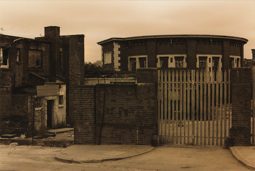
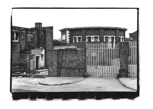
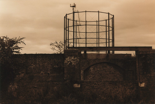
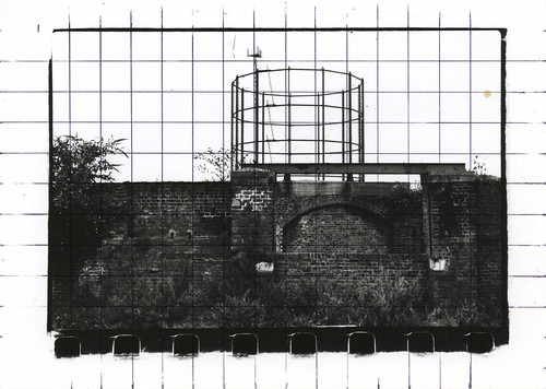
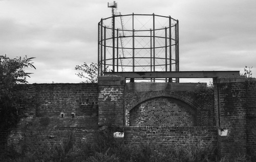
I had used significantly more contrast in the darkroom prints made in 1995, and, although I was probably happy with the results then, I am less keen on the blank skies now, and would probably try to retain detail through burning or split grade printing, or a combination of both. I had also made my own negative carrier in order to show the edges of the negative and a part of the perforations at the bottom edge of the image, something I now think of as an affectation - no doubt I had seen this effect in a book and had wanted to emulate it. The darkroom print from the photograph below is squared up with a grid to use the image as reference for a painting - and subsequently used for a second painting, too. Coincidentally, this location with the gasholder was photographed for the cover of the Tyrrel Corporation's single 'You're Not Here' with the two band members sitting on the low wall in front of the arch. The single was released in 1994 and I remember flyposters advertising it on hoardings in Ilford town centre around the time I took my photograph below: also, coincidentally, the cover of the single and the images on the posters happened to be in sepia.

Praktica BCA with Ilford XP2, scan from lab print
Scan from print on Jessops VC paper
Scan from negative
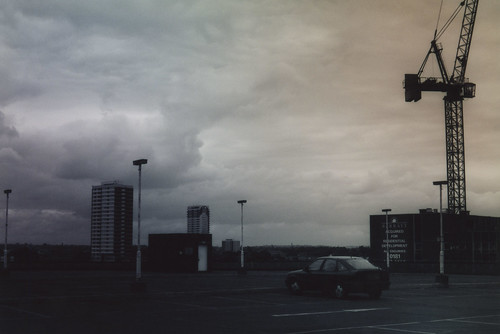
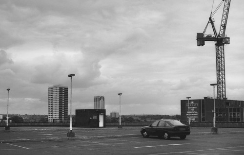
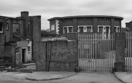
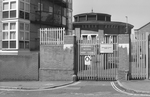
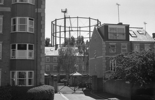
After scanning the original negatives of these two photographs alongside the two different prints, I had the idea to revisit these two locations this summer, to photograph them again on Ilford XP2 Super, twenty-four years to the day. I had thought that these images had come from my first roll of Ilford XP2, but, on closer inspection of the dates and diary entries, these turned out to be from my second roll of the film. The first had been shot over the preceding two weeks, including the shot at the top of this post, but I did get both rolls processed at the same time - at Boots in Ilford, of all places - I had handed in the first roll beforehand, to Jessops I believe, but they returned the film undeveloped, telling me that they couldn't process it (perhaps they had been thinking of XP1, which had its own developer), at which point I took the two rolls to Boots: Ilford XP2 provided them without any difficulties, and I had Boots process a few more rolls of film after that.

As I no longer have my Praktica BCA, I used a Zenit 11 in order to shoot with a screw-mount 50mm f1.8 Prakticar lens - the same lens as used on the BCA (which would have been a Praktica bayonet mount of course, but the lens design would be the same; at the time I only had the standard 50mm lens; later I would get a 28mm and a 70-210mm zoom). The weather twenty-four years ago had been overcast (my darkroom prints made a year later simply omitted the cloud detail in the negative through using high contrast filters); shooting the same subjects this summer, at the tail end of the longest heatwave for forty-two years in England, the weather was unfailingly sunny.

Rotherhithe, August 2018; Zenit 11 with Ilford XP2 Super
Rotherhithe, August 2018; Zenit 11 with Ilford XP2 Super
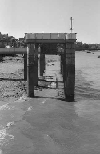
The subjects of the two photographs from 1994 which appear in the lab and darkroom prints are only a few metres apart, on the south of the river Thames in Rotherhithe; the first shows the southern ventilation shaft to the Rotherhithe Tunnel. The shaft building itself remains, although this now has a roof; the gate and gateposts are the same, but the outbuildings have been replaced by a newer residential block since, a process that has changed the view of the gasholder in the second photograph even more radically. By 1994 most of the operations of the London docks had moved miles further east to Tilbury, and this area alongside the Thames was in between cycles of speculative building: the boom of 'Docklands', largely on the Isle of Dogs on the other side of the river, had slowed in the wake of the recession of the early 1990s. Redevelopment of the area was restarted towards the end of the decade and into the 2000s, with the impetus of the Millennium Dome and improved transport links, as well as the general economic climate of the time.

Rotherhithe, August 1994; Praktica BCA with Ilford XP2
Rotherhithe, August 2018; Zenit 11 with Ilford XP2 Super
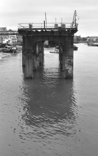
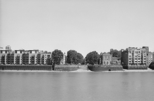
Discovering photography and exploring London went hand in hand, and I would return to these areas a number of times in subsequent years, shooting in medium format when I bought my Ikoflex Ic a couple of years later. This was an area relatively close to where I had been attending college in east London earlier in 1994, a couple of stops down on the old East London line on the Underground from Whitechapel. Its proximity was one attraction; the other was the sense of abandonment - that there were still second world war bomb sites in London that hadn't been built on, fifty years after the end of the war - and the mild illicit thrill of climbing through holes in fences or over walls to take some of these photographs. One particular location that I photographed on Ilford XP2 in 1994, on the other side of the river from Rotherhithe, in Wapping, was that of Watson's Wharf on Hermitage Wall. This had been derelict since the war; it had been the site of a large air raid shelter which had also been the base of the 'Dead End Kids', local teenagers organised into a group of unofficial air raid wardens and firefighters, some of whom had been killed while on duty. Local residents had wanted to turn the whole site into a memorial garden to commemorate Londoners who had died in the Blitz; around the time I had photographed it, the site had then been recently sold to the London Docklands Development Corporation and there were notices from a group called Civilians Remembered along the railings and fences around the site. The building seen side on in the photograph from 1994 below marks what would have been the boundary of the proposed memorial garden. In the photograph from this year, it can been seen face on, behind the tree, just to the left of centre: the foreground of the first photograph is now built over with the large block of apartments that takes up the whole left hand side of the second photograph.

Watson's Wharf, Wapping, August 1994; Praktica BCA with Ilford XP2
View of Wapping, August 2018; Zenit 11 with Ilford XP2 Super

Thursday, 27 September 2018

Ilford XP2 Super - Part One

Ilford XP2 Super, shot on XP2 Super, 35mm and medium format 
WHY XP2 SUPER IS DIFFERENT 
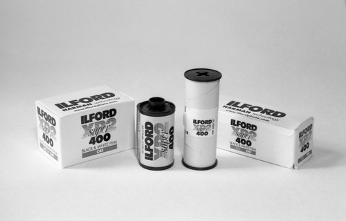
XP2 SUPER is a chromogenic film. This means that the dyes which make up the image are formed during development rather than being present in the film or added later. The extremely wide exposure latitude of XP2 SUPER is the result of the unique relationship between exposure and grain in chromogenic films. The best balance of sharpness and grain is obtained when XP2 SUPER is exposed at EI 400/27. However, down-rated or overexposed XP2 SUPER negatives have finer grain, the opposite of that expected and obtained with conventional films. Up-rated or underexposed XP2 SUPER negatives have only a slight loss in quality. Furthermore, standard C41 processing is recommended for the whole of the exposure range.
Ilford XP2 Super data sheet
At some point over the last four decades, all the big four film manufacturers marketed chromogenic black and white films: Agfapan Vario XL was the first such film, followed by Ilford with XP1; Kodak produced BW400CN and Fuji had Neopan 400CN (although this film itself is made in Europe with  Ilford being involved in its manufacture). The reasons that chromogenic black and white films were developed surround the simple logistics of standardised C41 negative processing: once this infrastructure was established - the typical high street one hour photo - the rationale for a black and white film which could be processed in this way was clear. Chromogenic films had an appeal to two distinct types of customers: for the amateur, wanting to use black and white but unwilling to either pay the premium for black and white processing or endure the wait while the film to sent to a specialist lab; for professionals, the film could be developed alongside colour negative film and lab prints from chromogenic film could be treated as proofs for later bespoke printing by hand in a darkroom. In some respects, XP2 Super's distinct features - C41 processing and wide latitude - make it an ideal choice for someone wanting to shoot black and white film for the first time. Ilford XP1 400 was announced at Photokina in 1980, a year after Agfapan Vario XL, and a year after Ilford's centenary. The first version had its own chemistry as well as being able to be processed in standard C41 chemicals. XP2 succeeded XP1 in 1991; the film was "updated" with no name change in 1996; and it reached the current iteration of Ilford XP2 Super twenty years ago this year in 1998. The Super suffix for XP2 would appear to be the equivalent of the 'Plus' versions of HP5 and FP4.

Although of any particular film stock HP5 Plus is almost certainly the film I've used more than any other, Ilford XP2 Super may be the one film I used most intensely, for a number of years when I didn't have access to a darkroom and did not develop at home: I used it as my standard black and white film, mostly through the early 2000s. Since returning to developing negatives myself, I've not used XP2 very much, but, at the end of last year, I bought a brick of 10 24-exposure rolls of 35mm XP2 Super at a clearance price due to being out-dated. The films were dated September 2016 - and as it was then only a year out of date, I've made no adjustments in exposure to compensate for age - and these films were priced at £1.50 per roll, and even though this was closer to £2 each with postage, this was still very economical, and I had no doubt that the age of the film would be as close as negligible in terms of its results.

Ilford XP2 Super latitude test contact sheet (C41 process)
One of Ilford's claims for XP2 Super is that it has exceptional latitude and can be exposed at a range of exposure indexes with no adjustment in processing times:
XP2 SUPER film has a speed rating of ISO 400/27° (400ASA, 27DIN, EI 400/27) to daylight. [...] Although rated at ISO 400/27°, XP2 SUPER can be exposed over the range EI 50/18–800/30. When higher speed is needed, XP2 SUPER can be rated at up to EI 800/30. For finer grain, when speed is less important, rate the film at EI 200/24, although for finest grain it can be rated as low as EI 50/18 if required.
Although I had used XP2 Super a great deal in the past, I hadn't made any kind of systematic tests at the time. Like other films written about on this blog, for this post, I wanted to make some tests as to the film's capabilities, and I began with a latitude test. I shot a roll of XP2 Super with two sequences of six frames rated at exposure indexes rated 50/100/200/400/800/1600. The rest of the roll was rated at 200 and this was processed professionally with C41 development. The results of the tests on this post were scanned; a more comprehensive set of tests would include darkroom printing, but the scanned negatives should provide some relatively comparable results.

Ilford XP2 Super rated EI 50
The suggestion from Ilford's data sheet with regards to the relationship of density to fineness of grain does appear to hold true: I've never had a reason to rate XP2 as low as EI 50 before, but the frames so rated have a smoothness to them that might seem surprising for a 400 ISO film. This is apparently due to the way that the dye clouds which replace the silver in processing overlap. In practice, however XP2 Super is rated, this does have the effect that the grain is finer in overexposed areas, while the grain is more pronounced in the shadow areas, the opposite effect to the case with traditional black and white negative film, where denser areas provide more visible grain. One aspect of this unique peculiarity makes XP2 Super particularly good at rendering skies in landscapes with much smoother tones than one might achieve with a similar speed conventional black and white film, for example. However, when rated at an exposure index of 50 or 100 it appears there is some compression of the tonal range; the date sheet has a curve with a very shallow shoulder. In addition, it would appear that rating the film for 'finest grain' is at the expense of sharpness; this may seem counter-intuitive, but, on consideration, a denser negative would logically be less sharp than a thinner one, though how great a difference one might perceive in a print or scan is not something I've tested for here.

Ilford XP2 Super rated EI 800
At the other end of the exposure scale, grain appears to become apparent in the mid-tones through to the shadows when rated at EI 800, but squeezing an extra stop from the film in low light conditions without any change to processing - and on the same roll as frames exposed at different ratings - is potentially very useful. Ilford do not recommend push processing with Ilford XP2 Super, and I have not test the feasibility of this with C41 processing. However the frames rated EI 1600 displayed quite a pronounced grain, which my tests, looks quite visually unappealing - unlike some traditional black and white films, where the visual texture of the film grain adds something to the image, rather than detracts.

Ilford XP2 Super rated EI 1600
The remainder of this test roll I shot at EI 200, and this became my standard practice when available light allowed while shooting a number of rolls of XP2 Super subsequent to making the latitude test.

Ilford XP2 Super, rated EI 200
One aspect of the film that I was keen to test for this post was the difference between processing XP2 Super as intended by C41, and compare this to XP2 Super developed using traditional black and white chemicals. For this second latitude test, I used the same camera (a Canon A-1) and the same ratings of 50/100/200/400/800/1600 for two successive series of six shots. Again, the remainder of the roll was shot at a rating of EI 200. Ilford does not recommend using black and white chemicals to process XP2, but, like any film, it's based on a silver negative: as with a colour negative film, the developed silver is then bleached and replaced by dyes; unlike a colour negative, of course, there's only one layer. Therefore, there's no reason that it cannot be developed as a black and white negative, but it is not intended for this and so it may not necessarily give the best results - which was something I wanted to test (and unless otherwise stated all the images on this post were from C41 processed negatives). I have previously used stand development with Rodinal with XP2, a good all-round method for developing almost any film, but there are listings on the Massive Dev Chart for a standard small tank development routine with intermittent agitation. The listing for Rodinal is given as 18 minutes at 20ºC at a dilution of 1+25.

Ilford XP2 Super latitude test contact sheet (developed in R09)
In the event, for the test roll in black and white chemicals, I developed the film for two minutes longer at a degree cooler in temperature. With the two latitude tests, I printed contact sheets on variable contrast paper without a contrast filter, with the result that these would be the equivalent of using grade 2 paper. The difference between the use of black and white chemicals and C41 processing was immediately clear: with black and white chemicals the film's contrast is notably greater, and its latitude appears less. In both tests, the frames rated 1600, two stops underexposed, shadow detail appears to dramatically drop off, but this was even more marked with the film developed in R09. One final note on the differences, interestingly, is that there appears to be less base fog with black and white chemicals, which may increase the overall contrast. Further, I did not try push-processing in black and white chemicals (as with C41 development) due in part to the already long development times.

Ilford XP2 Super, rated EI 50, developed with R09
Scanning the negatives developed in RO9, one issue I had was that the density in the highlight areas resulted in noise, which, while distinct from the grain itself, made it difficult to assess the appearance of grain when developed in traditional black and white chemicals. It was immediately obvious that the particular characteristics of XP2 Super are as a direct result of being developed by the C41 process: in black and white chemicals the results are fairly unremarkable. However, some of the images that were rated at EI 200 rather than box speed still had a relatively smooth, fine-grained appearance, and possibly, if not developing XP2 Super as colour negative, this procedure might give the best results.

Ilford XP2 Super, rated EI 200, developed with R09
Other black and white developers will also work with XP2 Super: the Massive Dev Chart has a limited list. One developer that I use frequently not on the list is Ilfotec LC29; I've only used this for one roll of Ilford XP2 (not Super, it had a 'develop before' date of Nov 1996) and made a calculated guess of a dilution of 1+29 with a time of 14 minutes at 18ºC. This worked well enough but I would want to make more tests with Ilfotec LC29 before recommending it with these times and dilutions.

Voigtländer Avus with Ilford XP2 (6x9 medium format) developed in Ilfotec LC29
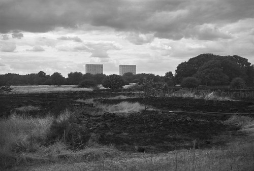
In terms of XP2 Super's specific characteristics with C41 processing, its latitude can sometimes produce images which appear 'flat' with a fairly straight print or scan, that is without increasing the contrast - or other manipulation such as dodging and burning. The contact sheet of the C41-processed  latitude test film above shows this, especially when compared to the black and white processed film. This latitude is a benefit when shooting scenes with a wide range subject brightness range: it's especially good for maintaining detail in skies for example. The image below has fairly good modelling in the clouds, which, although obscuring the sun, were brightly lit against the overcast landscape of burnt grass, and, with a small amount of digital burning in (only useful if the detail is there to begin with), has the sort of effect one might perhaps achieve with a light yellow filter. In low-light scenes like night time urban settings, which often have isolated highlights and deep shadow areas, XP2 Super does seem to be quite good at managing these wide variations in illumination (it does suffer reciprocity law failure, but the night shots on this post were taken handheld, without long exposures; also, I haven't made accurate comparisons between C41 and R09 processing for such subjects).

Voigtländer Bessa RF (6x9 medium format) with Ilford XP2 Super
Zenit 11 with Ilford XP2 Super
When Kodak announced that BW400CN was to be discontinued in 2014, Ilford took the opportunity to produce a comparison sheet. One of the obvious advantages of Ilford's chromogenic film over Kodak's always was that it was available in medium format as well as 35mm (it is also now available in single use cameras; XP2 was once available in sheet film but this was one format I have neither seen or used). The other notable points of comparison are XP2 Super's wide exposure range: the sheet gives BW400CN as "400 – Not specified in technical data". In addition, BW400CN was coated onto a standard colour negative orange base, which one might imagine to be less than ideal for printing on black and white variable contrast paper, as well as for scanning. Ilford's film has a pink base, which varies in intensity depending on wash times - some of my negatives look almost clear or at least a light grey without much discernible colour, while others are quite pink. Ilford XP2 Super has a fairly distinct place in the film market now, a niche which it shares with Fuji Neopan 400CN (which, although not confirmed by Ilford, is, according to some, the same emulsion). One would hope that its distinct characteristics should mean that XP2 Super has a place in Ilford's range of films for the foreseeable future.

Belomo Agat 18K with Ilford XP2 Super
Praktica nova I with Ilford XP2 Super developed in R09 One Shot
Lomo LCA with Ilford XP2 Super
Zenit 11 with Ilford XP2 Super
Kiev-4 with Ilford XP2 Super
Kiev-4 with Ilford XP2 Super developed in Fomadon R09
Canon A-1 with Ilford XP2 Super (scan from lab print)
Canon A-1 with Ilford XP2 Super
Canon A-1 with Ilford XP2 Super developed in Fomadon R09
Wallace Heaton Zodel camera (rollfilm back with 6x4.5 mask), Ilford XP2 Super
Voigtländer Bessa RF (6x9 medium format) with Ilford XP2 Super
Ilford XP2 Super - part two

Sources/further reading
Ilford XP2 Super data sheet
XP2 Super/BW400CN comparison sheet
In Praise of XP2 Super - Richard Pickup
Ilford XP2 - an under-appreciated film - The Web Darkroom
How to shoot Ilford XP2 Super - The Online Photographer
Ilford XP2 Super in Black & White Chemistry - Christopher Moss