Showing posts with label HP5 Plus. Show all posts

Monday, 18 March 2024

'WELCOME TO ESSEX'

Grove Green Road, 18th March 1994
Growing up in Ilford in the 1980s and 90s, its identity as being part of London was somewhat ambivalent: ‘London’ for me was something that happened after you got on the tube (and passed the destruction along the Central Line as the houses in Leytonstone were being demolished). Ilford had been part of the new London Borough of Redbridge established in 1965, but retained an Essex postcode, and in some respects it felt as though it faced out towards Essex along Eastern Avenue (to which the M11 Link Road would join as part of the approach to the Redbridge Roundabout) as much as into London in the other direction, and the quality of being on the edge of the urban sprawl was very evident: one had to only go to a number of stations on the Newbury Park loop of the Central Line to find the point at which the march of bricks and mortar were halted by the green belt. Despite being born in central London, and spending most of my childhood and adolescence in a London Borough, it was only leaving to study for my degree when I was defined (by others) as a ‘Londoner’.

The poster in the image above from which this post takes its name was advertising the album Essex by Alison Moyet, released the Monday after the day I took these photographs (as was the Deacon Blue single), named for the singer’s native county. Of the other music postered to the corrugated iron fence, Carter the Unstoppable Sex Machine had been popular among a certain section of the sixth form I’d recently left; the Soul Asylum record had been out for well over a year by the point I took the photograph, but possibly was being promoted after the single Runaway Train had won ‘Best Rock Song’ in the Grammys earlier that month. This arbitrary selection of posters might in some way indicate popular music at that point early in 1994: ‘Britpop’–however defined–hadn’t quite made itself felt culturally at that point; Parklife was released at the end of April, a few weeks after these photographs were taken.

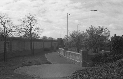
On 18th March 1994, as on previous occasions,  I walked between Leytonstone and Leyton stations to take photographs along the route of the M11 Link Road. It had been a whole month since the last photographs, and I was aware that more buildings had gone in the weeks since, but I took less pictures, just nine frames, before getting back onto the Central Line and going to visit the Sir John Soane's Museum (where I took quite a few photographs), and the British Museum to see an exhibition on Victorian illustrated books, and bumped into someone I knew from school drawing from the Parthenon sculptures. I took no photographs on Dyers Hall Road, where I taken numerous pictures a month before. Instead, the sequence begins on Grove Green Road with two very similar photographs; this section of Grove Green Road became the Linear Park. In 2014, when I revisited the locations to take photographs twenty years on, the Linear Park had railings along the road–which have subsequently been removed.


I can't quite be sure that the photographs from 2014 were really in the right place–the facing terraced houses seen at the right of the bottom pair of images does provide some orientation, but the Linear Park represents quite a long stretch of road where numerous buildings–not just houses–were demolished. The weather on 18th March 1994 was similar to that of 18th February, the previous date I took a series of photographs, heavily overcast, although less misty. In 2014, it was sunny, and photographing into the light for a number of shots, the Prakticar f1.8 lens imparted some haze to many of these images.

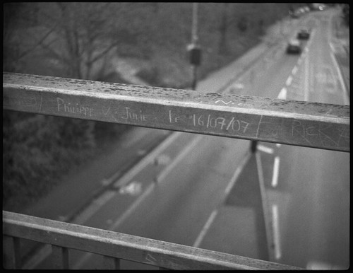
The picture at the head of this post is the corner where the northern end of Claremont Road met Grove Green Road and used to feature a short parade of shops. That there is a billboard on the side of the house above the remains of number 153 on the corner suggests that this house had been demolished some time previously. The end of this terrace was pulled down to number 143; two newer houses were built adjoining 143 after the completion of the road, which can be seen in the picture from 2014, below. This end of Claremont Road has completely disappeared, making for a generous width of pavement and a more gentle angle for Grove Green Road to meet the rebuilt Cathall Road bridge, to the left of the picture below.


I took one photograph on Claremont Road itself, replicating a colour photograph taken in January at the southern end of the terrace facing the railway line; the remaining stub of this end of Claremont Road provides the opportunity to take a similar photograph, but in reality this should be shot from a position hovering over the A12.


The rest of the photographs were taken on Colville Road, some made standing on the remnants of garden walls to look over the fences, possibly reinstated from when I'd taken photographs a month before and had found a number of them torn down, and took some pictures from behind the fences. In the pair of images below, the picture from 2014 is too far to the left: the line of Colville Road was moved, and as a result the corner from 1994 would be under the current wall alongside the A12. 


As with a number of my other photographs, replicating the views in 2014 (and today) results in pictures of this brick wall, with little else to enliven the compositions. Many of the mature plane trees on the far side of the railway are still recognisably the same trees however, providing one point of reference when rephotographing.


The last two photographs from the 18th March were taken at the far end of Colville Road. Here, Langthorne Road crossed over the railway. Now a foot and cycle bridge, before the building of the A12 this was a road bridge, a presumably a cut through from Grove Green Road to the other side of the railway avoiding the high road. Langthorne Road has almost disappeared, the section that joined Grove Green Road being pedestrianised; in a similar fashion, at the other end of this stretch between the two Underground stations, Church Lane used to join Grove Green Road under the railway from the other side of Leytonstone Station. Now a a dead end road on the other side of the Central Line, Church Lane's junction with Grove Green became a playground and an approach to the footbridge which took its place. 


Saturday, 17 December 2022

'After Vermeer'


For many years, it was known that Vermeer's painting Girl Reading a Letter at an Open Window originally had a large painting on its far wall parallel to the picture plane which had been painted over. It was believed that  this had been done during the artist's lifetime, with the inevitable conclusion that this act was by the artist himself; more recent analysis had determined that a layer of dirt underneath the overpainted area must have taken decades to accumulate, and therefore the painting–or the version of it as had become familiar since the mid-nineteenth century ‘rediscovery’ of the artist–did not in fact reflect Vermeer’s intention for the work. The painting, held in the Staatliche Kunstsammlungen, Dresden was painstakingly restored, with the later overpaint removed, revealing a framed picture of Cupid holding up a playing card, which appears in two other works by Vermeer. The radically restored painting was the centrepiece of an exhibition, 'Johannes Vermeer: Vom Innenhalten (On Reflection)', at the Gemäldegalerie Alte Meister, housed in the Dresden Zwinger late last year. 

A couple of years ago I wrote about my interest in the art of Vermeer in two posts, Cameras Obscura and A View of Delft. These were written after a trip to Delft, Amsterdam, and the Hague, and the work which I had made there, referencing the long-speculated upon use of optical technology–the camera obscura–by Vermeer, and by another Delft painter, Carel Fabritius, the evidence of which appears to be present in their paintings to a greater or lesser degree. This ‘pre-history’ of the photographic has long been an interest of mine, in relation to my own paintings and their relationship to photographic source material, and I had, in the past, made work with specific references to the paintings of Vermeer. As part of the Staatliche Kunstsammlungen Dresden’s accompanying programme to 'Johannes Vermeer: Vom Innenhalten', there was a small display in the Zwinger’s Café Algarotti. This showed three photographic works in dialogue with Girl Reading a Letter at an Open Window: Alfred Stieglitz’s Sun Rays—Paula, Berlin (1899), which depicts the photographer’s sister writing a letter by an open window, strikingly illuminated through slatted blinds; Tom Hunter’s Woman reading a Possession Order (1997), more directly referencing Vermeer’s painting; and my own After Vermeer. In the Zwinger’s display, this was a digital print, a composite image constructed from a number of photographs which had originated on film. 

After Vermeer, digital composite

As an artwork in its own right, this particular version of After Vermeer had only ever existed as an image on a website many years ago–it was made as a reference image for a painting, one component among others, a working image for part of a trompe l’oeil painting: the painting as a whole had the conceit that it shows a section of an artist’s studio wall. The photograph was paired with a photocopy of the two-page page spread showing the reproduction of Girl Reading a Letter by an Open Window from Arthur J. Wheelock’s book on Vermeer. In the painting, my version of the Vermeer composition appears as a photograph that the artist is working from to make a painting: in the trompe l’oeil, this image has a grid drawn (painted) onto it for the purpose of transferring the image, usually with an element of scaling up, to this notional painting’s surface.

The Artist's Studio I, oil on board, 56x72cm

I had initially planned four trompe l’oeil paintings in the series of the studio wall. The painting with the photocopy of Vermeer’s Girl Reading a Letter at an Open Window was selected for the Royal Academy Summer Exhibition in 2001; a second painting, in the same format, with a photocopy of Edward Hopper’s Automat and my own composition based on it, wasn’t selected. I completed a third painting, with a composition of my own which was a more oblique referencing to one of Artemisia Gentilischi’s paintings of Susanna and the Elders, included within. The fourth painting in the series was started but never finished. All four paintings were designed to join together horizontally, with elements spanning from the edge of one painting to the next (that the compositions are cut off at the edges points to the paintings being ‘about’ or using the approach of trompe l’oeil, rather than being true trompe l’oeil works). I kept the board for the fourth painting for many years afterwards. It had a slight bit of painting of the overlapping newspaper clipping. Eventually this got damaged and the board was cut up to be re-used. 

At the time I made this series, in early 2001, I had no intention of making singular paintings of my own compositions within them which refer to the historical paintings that were their inspiration. This was partly that I (then) had a resistance to making paintings that appeared as if (based on) a single photograph, a resistance I relinquished a year or so later. From the other trompe l’oeil paintings completed in the series I used the digital images of my compositions for two back-lit transparencies mounted on lightboxes which were exhibited a couple of times; my version of Vermeer's Girl Reading a Letter at an Open Window was never made into a lightbox, partly a result of being dissatisfied with the quality of the images, mainly as a result of being made relatively cheaply. I began an etching of the image from the composition based on Edward Hopper’s Automat but this was never finished; the other composition I had made as a postcard before eventually using it, with a number of changes, as the basis for a larger painting.

After Vermeer, oil on canvas, 80x50cm

I returned to the Vermeer composition five years later to make a single painting. This was shown in an exhibition at a gallery specialising in photography and subsequently sold. When I received an email from the Dresden museum, my initial supposition was that they wanted to shown my painting in the accompanying programme; this has had a handful of enquiries in the years since I sold it and is now no longer accessible. However, they were interested in the photograph of After Vermeer, which had never been made into a physical version, only ever existing as a digital image on my website, on a page long since orphaned from the site itself, but still online (for a time, there were in fact two digital versions of the composition on my website, the first with a different position to the model’s head). I didn’t ask how the curator stumbled across this, but was relieved that I could show the photographic After Vermeer: as well as the rather low-resolution jpeg online, I still had the original working Photoshop file on a disk. 

A number of things came together to provoke me to make After Vermeer. The initial spark came from receiving a photograph of Tom Hunter’s picture from a teacher that I was still in touch with. This must have been after Woman reading a Possession Order was exhibited at the National Portrait Gallery, receiving a certain amount of exposure. I happened to be living in the London Borough of Hackney at the time, from the very end of the 1990s into the 2000s and, as a result, many of Tom Hunter's locations became very familiar to me, with just a faint, occasional sense of our paths crossing, with Hunter, no doubt completely unaware, several, many steps ahead. At the time I was still working out what kind of artist I wanted to be, but very quickly painting became predominant, although in 2000 this wasn’t entirely clear, and in recent years photographic processes in their own right have become more important once again. I hadn’t studied painting at degree level, studying printmaking instead; after art college I pursued painting as this seemed the easiest route at the time, something I could do in my rented room with the minimum amount of equipment (and cost), not needing a workshop, making do without a studio. 

Contact sheet, Zeiss Ikon Ikoflex Ic with Ilford HP5 Plus

The architecture of the kitchen of the rented house in which I was living at the time allowed me to create a very similar composition to Hunter’s photograph, with a large window to the left over the sink providing just the right kind of diffused light, similar to Vermeer’s original and Tom Hunter’s version. There was space, under the stairs by the back door, to stand far enough back to take the photographs. I think I had planned to combine a number of photographs together to make the digital image to work from for the painting: this allowed me to select from different shots, and combine these to make something closer to Vermeer’s painting. At the time, I imagined this to be like working with photography as a painter works, but, perhaps, this was more to do with not having the confidence to achieve what I wanted in a single photograph itself (I had been much taken by Jeff Wall’s working processes at the time, with pieces such as The Flooded Grave impressing me, although it’s very clear, practically, as to why that work could not be made as a single photograph). Unable to ignore the fact that this was a kitchen, I chose to depict the mundane action of drying dishes, with the light itself standing in or conferring any sense of a moment of the sublime, a contrast to Tom Hunter’s understated photograph given a sense of affect through its title. I did originally call my work After Tom Hunter After Vermeer.

Contact sheet, 35mm Ilford XP2 Super

Returning to the original Photoshop file, I discovered that, on closer inspection, it wasn’t really finished: good enough to paint from, I hadn’t needed to ensure a level of finish as the digital file wasn’t to be the end result, but I was still surprised at the lack of care and attention to its editing. It had been made from scans of photographic prints rather than negatives: at the time, I had no access to negative scanning, nor a darkroom to make my own prints. The photographs were taken on medium format and 35mm negatives (from my Ikoflex twin-lens reflex and a Praktica BCA SLR: the strap for the Praktica can actually be seen in the final image, hanging down from being placed on the stovetop, just visible at the edge of the doorframe), but, working from small lab prints, the difference between the formats was probably negligible. This was still essentially a pre-digital world, photographically at least: the medium format film, Ilford HP5 Plus, was developed at a branch of Jessops that used to be in Moorgate; the 35mm XP2 Super went to Tesco on Bishopsgate, opposite Liverpool Street Station: the supermarket used a Kodak lab, and both were a convenient stop on my way to and from my part-time job on the other side of London Bridge. There was probably no consideration to use colour: black and white has a certain connotation of the ‘photographic’, historically situated of course, and a equivalence to the black and white photocopy from the book on Vermeer (with an incidental association to David Hockney’s approach in Secret Knowledge, reproducing paintings in black and white to emphasise their ‘optical’ look which the photocopy achieves). Opening the .psd file after twenty years, this had been saved with some separate layers (there were six layers, but with layers named Layer 8 and Layer 9, others had clearly been merged at the time), making it a little easier to edit the file to achieve what I hoped to be an acceptable a level of finish, neglected twenty years earlier. The original had been printed at 8x10 inches for the painting, smaller than A4 size; I was fortunate in that the curator found the image file to be sufficient in quality at double the size to include in the accompanying programme. Although I still had the original negatives I had been reluctant to remake the image from scratch–although I might have wanted to–and the re-edited digital file was printed for exhibition. I did scan the negatives later, and found that many of the frames were marred by motion blur or were poorly focused, possibly confirming my instinctive lack of confidence over getting it ‘right’ in a single shot.

The Vermeer exhibition opened around the start of the new academic year; I had hoped to go at the Christmas break (and was also hoping to be able to afford to do so too), which would have been around this time last year, to see the restored Vermeer, and to experience a work of mine on display in Dresden, reflecting on its afterlife as something made many years ago for quite different purposes. The emergence of the Omicron variant of the coronavirus meant that the exhibition shut to the public in November, shortly followed by UK nationals being prevented from travelling to Germany. Although 'Johannes Vermeer: Vom Innenhalten' closed at the start of this year, as scheduled, the accompanying programme display was extended into April 2022. Conditions sufficiently improved for travel into Europe in the spring, and I booked to do so in April, just before the extended display was due to finish.

The day before I left London for Dresden, I discovered that the accompanying exhibition in which my photograph had featured had already been taken down, short of the scheduled close its extended display, to clear the way for the accompanying programme for the next exhibition. This was 'Edward Hopper: Die inner und die äußere Welt (Inner and Outer Worlds)', opening a week after we were due to leave. In the Café Algarotti where the accompanying programme had been, I photographed my hand holding a mobile phone showing an image of this display–the image at the top of this post–no longer there by the time I had travelled to Dresden. The image within the image is too small to see my work, the framed picture on the right-hand side, disappearing behind the glare on the glass from the windows opposite, perhaps appropriate. Vermeer’s Girl Reading a Letter at an Open Window was absent, so I did not get to see the restored painting either; the Gemäldegalerie Alte Meister did have his Procuress on display, an earlier painting, where aspects of Vermeer’s particular stylistic approaches remain yet to be worked through, but the still life element of the painting equals that of many of Vermeer’s paintings in his mature style. The blue-and-white Westerwald stoneware jug is painted in sharp focus, existing in an isolated plane in depth, while the figures appear just out of focus, painted with some passages of incredibly thick paint, with barely any sharp outlines, the edges diffused, suggestive of a shallow depth of field from a camera obscura. The foreground carpet and fur provide a means to push the rest of the composition back away from the picture plane as well as hiding any compositional problems of how to resolve exactly how the figures are spaced around the table that the jug and glass are resting upon.

Recalling the kitchen of twenty years earlier, and making of that picture, the architecture in the apartment where we were staying in Dresden had an incidental affinity to Vermeer’s space: a window at right angles to the  kitchen worktop, admitted perfectly diffused light, picking out a kettle, some bread, with a heavy curtain casting a chair and a table into foreground shadow, coming together in a composition, photographed on colour film this time.


'Dresden', Zodel Baldalux with Fuji Pro 400H


Sources/Further reading

Sunday, 30 January 2022

127 Day January 2022

Zeiss Ikon Ikonta 520/18 with Ilford HP5 Plus
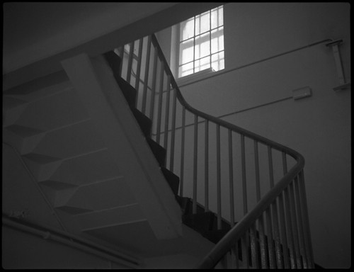
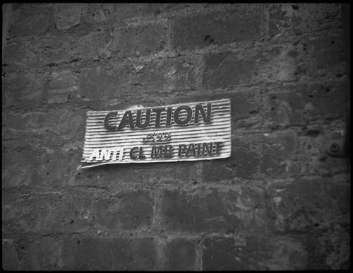
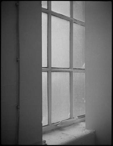
As I wrote in my entry for December's 127 Day, I rarely miss the opportunity of shooting 127 format cameras on the calendrical 127 days, and last Thursday's January iteration was no exception. It was however a working day, and in addition, the day began very dull and overcast, with very low light levels on the way to work shortly after sunrise–not dissimilar to the weather in December. I used the Baby Ikonta again, which has a moderately wide aperture lens at f3.5, compared to other 127 format cameras which I might have chosen had the weather been better. Partly as a result of the low light levels I took very few pictures on the way to work; then, with a busy day at work, I took fewer photographs than I might have done, just one roll of cut-down Ilford HP5 Plus, but the light did improve later in the day as the clouds cleared, and I made use of this, taking a few frames around windows before the light went. Had the day remained overcast, I might have been tempted to develop the film to compensate by adding a stop to increase contrast (I'd estimated exposure with reference to the 'Sunny 16' rule) but I went with box speed after the light improved, using Adox Adonal diluted 1+25 for 6 minutes at 20ºC.


Wednesday, 8 December 2021

127 Day December 2021

Zeiss Ikon Ikonta 520/18 with Ilford HP5 Plus
I haven't posted very much on this blog for the last few months, for various reasons, but I didn't want to miss observing 127 Day yesterday, and I did also have the time to develop and scan the negatives, not wanting to add to a backlog of half-written blog posts or unresolved tests of films and cameras. I shot one whole roll of cut-down Ilford HP5 Plus, and a couple of short rolls of off-cuts from having previously cut down medium format HP5 to 127. I chose the Baby Ikonta in order to get as many shots from the film as possible, with the nominal 3x4.5cm negative format (and, with a little care, on a whole roll of 127 film with the Baby Ikonta one can get 17 pictures rather than the 16 numbered frames). I revisited a number of the shots that I'd taken in this summer's 127 Day in July (although not using the Vest Pocket Kodak due to its light leaks); the weather condition were less conducive than the overcast July day then, with very flat and dull light and increasing rain. I did consider pushing the film one stop in development to increase contrast, but went with the standard time for box speed as I'd taken quite a few shots with the sky featuring rather prominently, and I thought that this might make any definition in the sky even more difficult to pull out. The results were very much as I would have expected given the lighting conditions, and even with a 400-speed film I did shoot with wider apertures than I might have liked for the Baby Ikonta's Novar lens, but for a ninety-year-old triplet lens, it performs well enough.


Friday, 2 April 2021

Thornton-Pickard Stereo Puck

Thornton-Pickard Stereo Puck
"It is often said in praise of a particularly good print that it is “almost stereoscopic.’’ With the Stereo Puck every good exposure is given full stereoscopic effect by dual lenses—and the cost of the outfit is now within everyone's reach." 
Thornton-Pickard advertisment
"...the New Wonder Camera The STEREO PUCK MAKES YOUR PICTURES LIVE"
Thornton-Pickard advertisment, BJP Almanac 1932
The prominent legend announcing the fact of the Thornton-Pickard Stereo Puck being "British Made" on the front plate above its lenses, much clearer than the faintly embossed name itself beneath them, brings to mind a scene from the sitcom The I.T. Crowd: in attempting to fight a fire, the character Moss points an extinguisher towards the fire, which promptly bursts into flame itself. Asking "Why's it done that?", Moss looks intently at the extinguisher, and there's a cut to a close up of a label: "Made in Britain", which provokes a knowing sigh from Moss. Intended, on the Stereo Puck, one imagines, to imply a mark of quality, this "British Made" assertion (as indeed for many a product) is at the very least an injunction for the consumer to patriotically 'buy British'. Something about this–the injunction and its instinctive reaction, as exemplified by Moss's sigh–as a general attitude, has an undercurrent of anxiety, of Britain's contemporary place in the world in relation to its long history, a history here of manufacture, but, by broader implication, its imperial history, a notion of a once-held 'greatness' (such a notion untroubled by any deeper examination), although Britain never seriously challenged the German, and then later, Japanese camera industries, and the Stereo Puck, "British made", was of course produced many decades ago. The association I've drawn with the example of the scene from The IT Crowd may be, perhaps, an unfair reaction, a knee-jerk attitude that itself needs examining, but in the case of the Stereo Puck, it's not entirely unwarranted.

I've long had an (occasional) interest in stereo photography, and when I saw the Stereo Puck come up in an online auction for not very much, I bought it on a whim; I used the camera for the first time two years ago for 'Take Your Box Camera To Play Day'; the film I shot then came out with scratches running through all the negatives, which was a little disheartening, and it had sat on a shelf since then, awaiting some remedial action. I was prompted to pick it up again by the #filmweekender box camera challenge from Twitter user Jason Avery: with a number of box cameras to choose from, I thought that the Thornton-Pickard Stereo Puck was sufficiently niche to warrant using it for this challenge.

Apart from its ability to take stereo pairs, the Stereo Puck is quite typical of the box camera form: it uses 120 medium-format rollfilm (itself introduced for the Kodak No.2 Brownie, the archetypal box camera); it has a fixed-focus simple lens; a single shutter speed; and a small reflecting finder for framing. It's wooden bodied, at a time when many box cameras were being made from metal (and early plastics like Bakelite were beginning to be used; the Stereo Puck's advance knob seems to be made from Bakelite) and the build quality suggests a certain cheapness: as an example, in the image below, the shutter lever on my camera can be seen to be not fixed entirely square-on to the camera body.
Thornton-Pickard Stereo Puck - top view

Thornton-Pickard did produce some fairly high quality cameras from the last decades of the nineteenth century, field and studio cameras, and, in particular, their reflex cameras and roller blind shutters. The Stereo Puck dates from the 1930s, by which time the company was in decline: it ceased manufacture in 1939 (it was preceded by the Puck, a more conventional box camera). In one of the advertisements quoted at the top of this post, three models are described, enumerated as the No.1, No.2, and No.3, all of which appear to have been available concurrently (at the time of the advert; when researching the Stereo Puck online, these numbers aren't usually used to differentiate its different variants). Sources online date the first version to around 1930, although the given dates vary. I've also observed that there were two versions of the model described as 'No.1': some show the metal tab in front of the handle which provides three different aperture settings, while some do not and presumably have just the one aperture setting. My version of the Stereo Puck is the No.2 and has the most commonly noted difference: this has the 'portrait' supplementary lenses, filters which swing in front of the lenses, easy to identify from the small lever next to the viewfinder, absent from the No.1. Finally, the advertisement describes the No.3 Stereo Puck, which has the ability to photograph either stereo pairs or single images (it's not clear how this works, and, from images of the camera online, I can't tell what might differentiate the No.3 in external appearance; it would be possible to shoot single images with the other models of the Stereo Puck by using a lens cap on one lens at a time–not easy to do due to the recessed lens fittings, with the 'cap' needing to be more like a plug–and not advancing the film until each side of the pair has been exposed).

The Stereo Puck takes (nominally) 6x4.5cm stereo pairs on medium format film, giving eight pairs on a roll of film; by necessity this image format creates a compromise in that the lens separation is noticeably narrower than that of human binocular vision. This is, apparently, a remarkably consistent physiological trait, with a distance of 6.5cm. Ideally, each lens then would be separated by this same distance to simulate stereo vision, but with the Stereo Puck, the lenses are separated by 4.2cm (I've read other distances online, but measuring my camera gives 4.2cm). There are circumstances in which lenses for stereoscopy would need to differ from that of the human eye, but these would be for extreme distances, both near and far, for microscopy or for imaging at distant ranges (to achieve a stereo image of a distant landscape, for example, it helps to have a much greater lens separation, otherwise both images appear too similar to create the illusion of depth). In the 35mm format, in order to construct a camera with a sufficient lens separation, the images have to be recorded on the film in a discontinuous series (i.e., the stereo pairs are not adjacent on the film), the most common method is to have the frame advance periodically 'jump' already exposed frames on the film, such as with the Stereocrafters Videon, where each pair is separated by two images of subsequent pairs on the film, which means that, as a sequence, after a first exposure, the film advances one frame twice in a row, then has to advance three whole frames to avoid double exposing one half of each stereo pair; other methods include exposing the film diagonally to avoid double exposure, as with the Meopta Stereo 35 and the Sawyers View Master. In medium format, the 6x6 image size is more typically used for stereo cameras as the wider image format means that the lens separation is greater; however, at the time that the Stereo Puck was produced, 120 medium format film only had numbers on the backing paper for the 6x9 frame size, which no doubt accounts for the Stereo Puck's design and use of the 6x4.5 stereo pairs, with the understandable compromise on lens separation (roughly concurrent with the Stereo Puck, the Rolleiflex popularised the 6x6 frame size on 120 film; while the Rolleiflex did not depend on frame numbers printed on the film's backing paper, evidently the format was attractive to manufacturers of cameras and film, and 6x6 frame numbers were introduced for less high-end 6x6 format cameras).

The user controls on the Stereo Puck are simple and limited. The shutter, tripped by a lever on the top right of the body from the user's position, has a single speed, reported between 1/20th-1/50th online, and a 'time' mode, with a small metal tab that pulls out to keep the shutter open until either pushed in or the shutter lever is flipped back to its original position: the shutter lever does not spring back to its original position, and so, like many older box cameras, this lever trips the shutter in either direction (on most single-lens box cameras of course, this lever runs up and down, rather than side-to-side), left-to-right or vice-versa. The lenses are fixed-focus four-inch f12.5 achromats; absent on some 'No.1' Stereo Pucks, there are three aperture settings with a metal tab in front of the handle that pulls out a strip of metal with holes punched behind the lens with click stops to provide smaller apertures. The aperture settings aren't marked, but logically these two smaller apertures are one stop successively smaller than the maximum aperture, giving approximately f18 and f25. The 'portrait' auxiliary close-up filters are hidden behind the front panel and pivot between the lenses. These can be swung in to position using the smaller lever next to the viewfinder. This lever is sprung, so the close-up filters return out of the way behind the front panel as soon as the lever is let go.

Thornton-Pickard Stereo Puck opened for loading

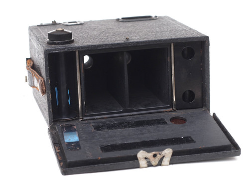
Loading the camera, the back is hinged on its leatherette covering; the back is made from wood, like the rest of the camera body, but has a metal outer rim that acts as a light trap with a clasp to secure it to the body. On one side, a curved spring attached to the back acts to provide pressure on the take-up spool. The two strips of felt inside the camera back appear to function as a pressure plate on the film behind the lenses; film advance it by red window using the 6x9 numbers. The supply side spool has a removable metal holder rather than the spring attached to the back; it's hard to see exactly what the design of this achieves, other than perhaps avoiding adding a knob on the supply side to secure the toll of fresh film. There is also a standard trip fitting in the base of the camera, but, for some reason, not centred either side-to-side or front to back.

Thornton-Pickard Stereo Puck with supply-side spool holder removed
When I first used the Stereo Puck a couple of years ago, its limitations were apparent. Some of these are an unavoidable part of the design, such as the narrow lens separation, but other issues are a result of the camera's construction, largely due to a lack of care in the manufacturing tolerances of the Stereo Puck. One of the first things I noticed is the disparity between the two sides of the stereo pair: the images are not well aligned in their vertical dimension, and, in addition, the focus on each side is different. These two aspects together might matter less in an inexpensive box camera with a single lens, but with two lenses, especially with a narrow stereo base, a good stereo image would be approved by the focus and alignment being better.

Thornton-Pickard Stereo Puck with Ilford HP5 Plus
In the image above, the left hand image is lower than the right; the left hand image also has better focus at the bottom of the frame, with the right hand image better at the top. The disparity in focus can be mitigated a little with using the smaller aperture settings, if lighting conditions allow when using the shutter on 'instant'. When creating stereo anaglyphs, the vertical alignment can easily be overcome simply by lining up the two images better, with a small amount of cropping. The ergonomics of the Stereo Puck take a little getting used to, especially if one is familiar with the more typical box camera form, as the shutter release and close-up filter lever are on top of the camera rather than at the sides; as with many a box camera, the viewfinder is merely an adequate indication of what direction the camera is facing and what might be generally in the centre of the frame.

Thornton-Pickard Stereo Puck (close-up filter) with Ilford HP5 Plus at 800
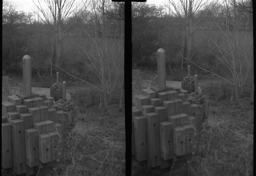
Picking up the Stereo Puck again to use it for the #filmweekender challenge, I carefully rubbed down the rollers at either side of the inside of the camera, which had some spots of corrosion, then polished these in an attempt to prevent the scratches that I had with my first roll of film and which can be clearly seen in the image above. I wasn't entirely successful, but the rather obvious gouges have become thin hairlines, much less obtrusive–in the image above, one has to enlarge it a fair bit to discern these lines. Possibly more polishing might remove these completely. I had a roll of Ilford HP5 Plus, and some Rollei Superpan 200; shooting on the afternoon of the 21st March, the weather was heavily overcast, with the result that I chose to push the HP5 Plus one stop in development, giving an effective exposure index of 800 (as I have remarked before, the idea that one should use a low ISO film in box cameras as these were the films available at the time such cameras were designed only holds true if one uses box cameras in the same way as they would have been used at the time: only taking photographs hand-held outside in bright weather conditions; in addition, possibly tray developing the film by inspection to make up for shortcomings in exposure, and possibly using intensification on the negatives as well). Most of the shots with HP5 Plus were hand-held although I did brace the camera against railings in at least one shot, and some used the close-up filter, supposedly for subjects of 1-3 metres, such as the image above. For comparison, I also took a couple of stereo pairs with and without the close-up filters, as below. Comparing the two pairs, the discrepancy in focus without the close up filter is as described above, with the focus better on the lower part of the left hand frame (although this is also closer to the lens), while focus it better towards the top of the right hand frame. Oddly, the close-up filter appears to reverse this trend, or at least, focus is better closer to the camera on the right, while on the left, the middle distance appears better.

Thornton-Pickard Stereo Puck with HP5 Plus at 800 (without close-up filter)
Thornton-Pickard Stereo Puck with HP5 Plus at 800 (with close-up filter)
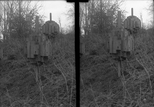
Opening the camera to remove the HP5 Plus, I was faced with something of a 'fat roll', and before loading the camera again, I bent all the springs forward in order to apply more pressure to the film; the HP5 had some light leaks at the edges of the last couple of stereo pairs, but not as bad as I had feared. When using Rollei Superpan, with an ISO of 200, this was too slow to use the camera hand-held; I could have attempted to push the film a couple of stops, but I've found Superpan to have relatively low latitude and pushing the film would be far from ideal. Instead, I used the odd wooden sculptures I had been photographing to place the camera on in lieu of a tripod and use the time setting on the shutter, generally stopping the lens down and exposing for around a second.

Thornton-Pickard Stereo Puck with Rollei Superpan (without close-up filter)
Thornton-Pickard Stereo Puck with Rollei Superpan (with close-up filter)
For the last couple of stereo pairs, I had inadvertently pushed in the tab for the shutter, so, without realising it, these were shot on the 'instant' setting, and, as a result, almost nothing registered on the negative. I developed both rolls of film in Rodinal, diluted 1+50 for 19 minutes at 19ºC, the time, temperature, and dilution that I'd settled on in my previous testing of Superpan, and close enough to the published times for HP5 Plus at 800 (16 minutes at 20ºC).

The Stereo Puck was sold with a stereo viewer, which my camera came without, but for which the negatives from the camera would be contacted for a print to fit the viewer. This should perhaps be also taken into consideration with the camera: at the scale of a contact print, the discrepancy in focus and alignment would be less obtrusive than in a larger print, or indeed a high resolution scan viewed on a screen. Instead of contact prints for physical viewing, I have been making red-cyan anaglyphs from the stereo pairs as the easiest iteration of the images, particularly online, correcting the alignment images while doing so.


One doesn't use a box camera for accuracy and precision, so perhaps the limitations and compromises of the Stereo Puck that I've outlined should be expected and accepted, particularly within its historical context. One imagines that, before the boom in 35mm stereo cameras during the 1950s, it made the taking of stereo photographs an affordable novelty at the time it was produced. For contemporary use, all these factors are hardly likely to make it a stereo camera of choice but, using it again for the #filmweekender challenge, after cleaning it up to prevent it scratching the film, perhaps it shouldn't have sat on a shelf for a couple of years.

Sources/further reading:
Stereo Puck on Camera-Wiki
Stereo Puck on Early Photography
Stereo Puck variants on Red Belllows
Model 1 without close-up filters or aperture stops on Welt Der Stereoskopie
Model 1 on Wood and Brass